

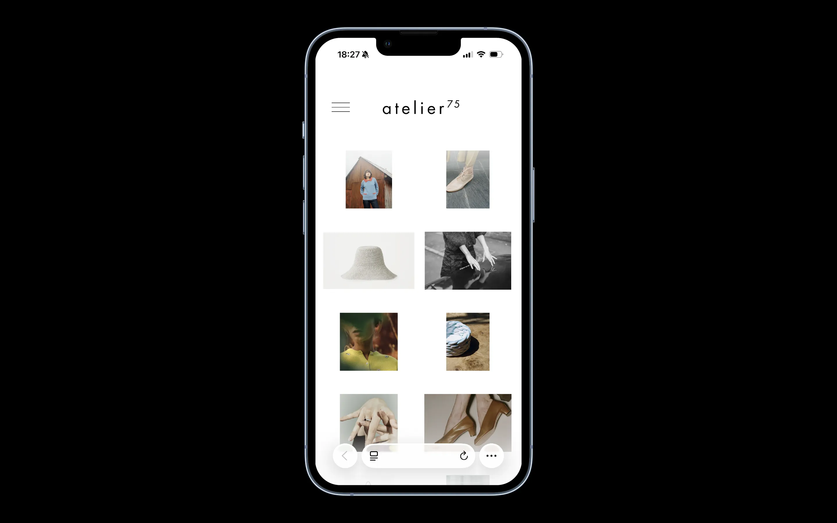
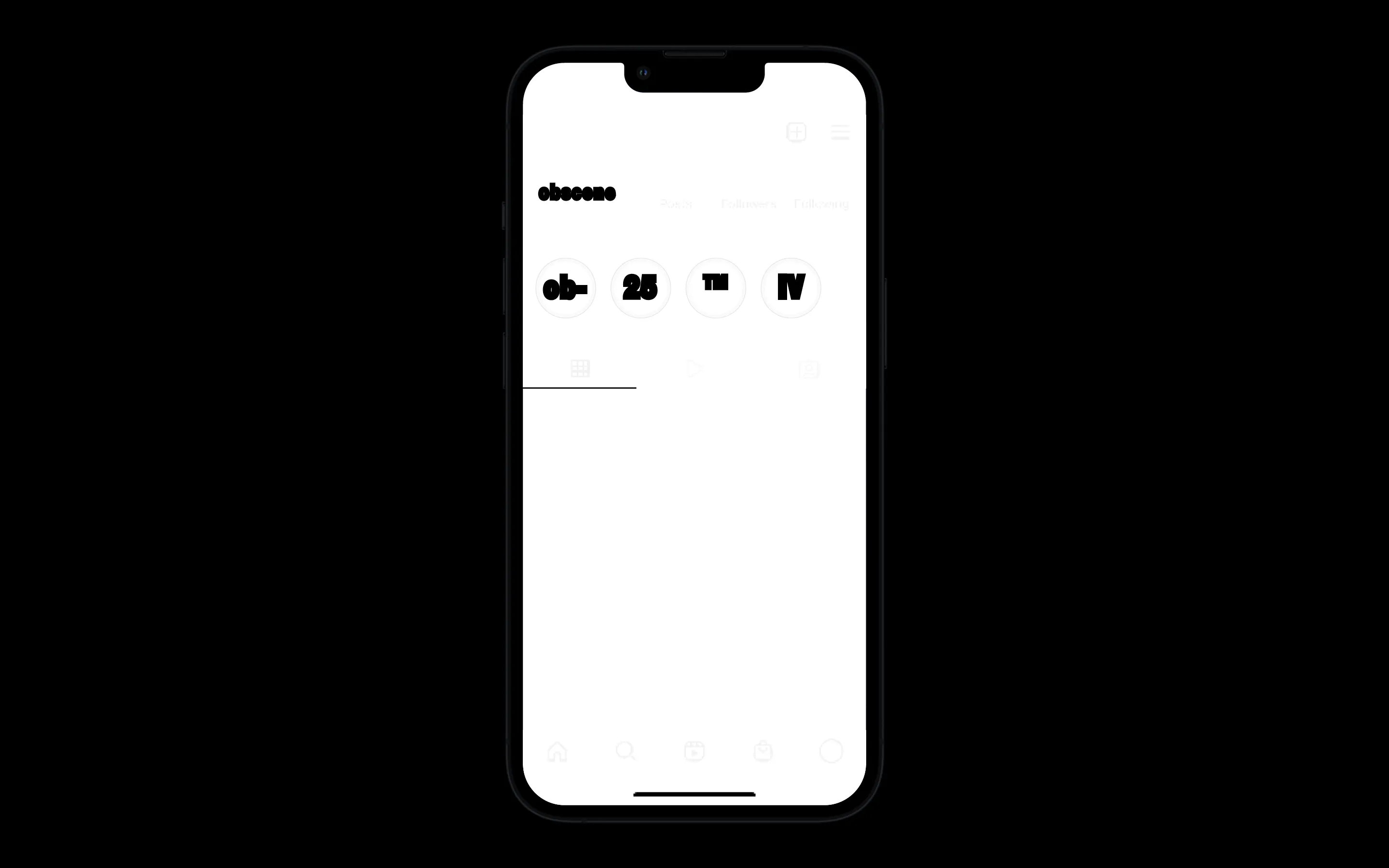
1 0 0 9 is a scenographic design studio that creates stages, exhibitions, installations and objects. Through storytelling and representation, we aim to challenge conventional perspectives in order to discover new ways of doing things. Teaching and research are a continuous backdrop to our work.
——
* Approach:
- Curating projects through scales
- A codex as generative architecture > A digital landscape
* Audience:
> Creative: Architecture, Art & Design, Cultural Institutions
> Editorial: Research & Publishing
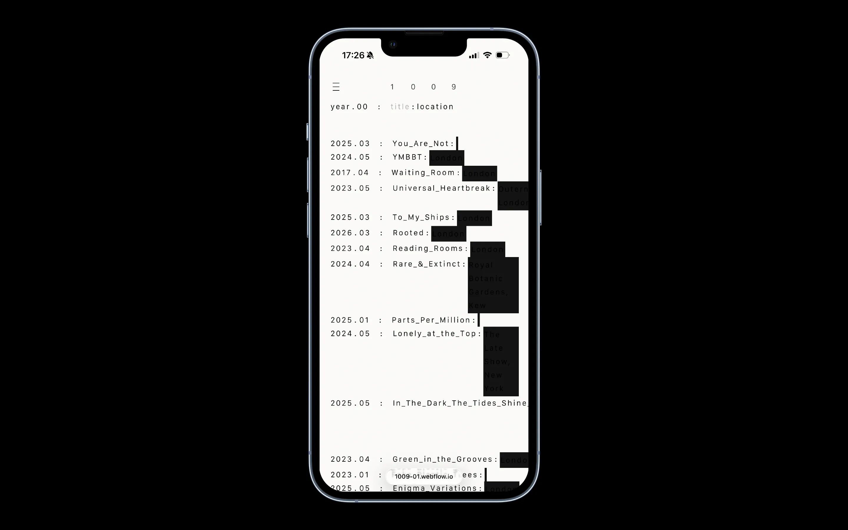
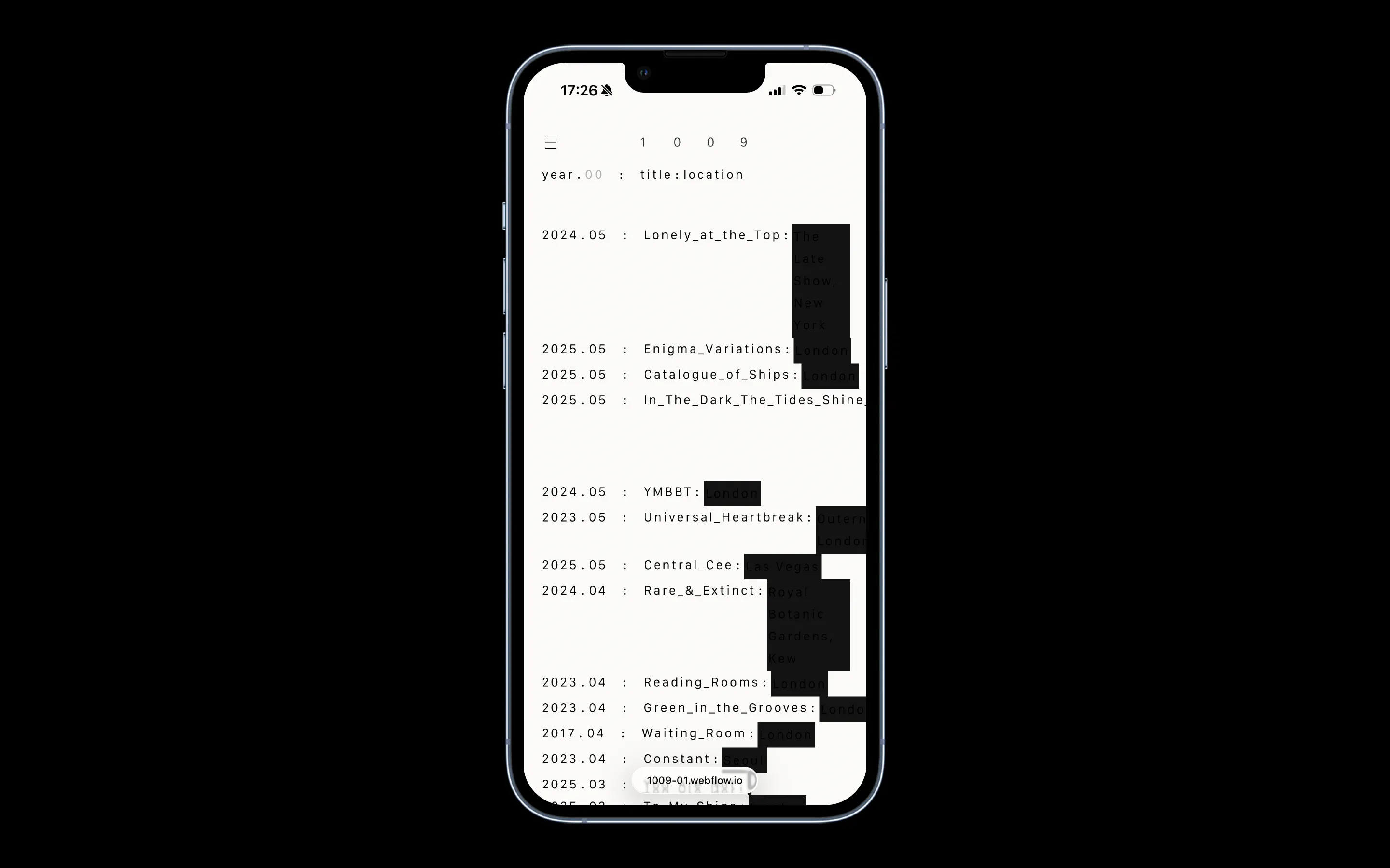
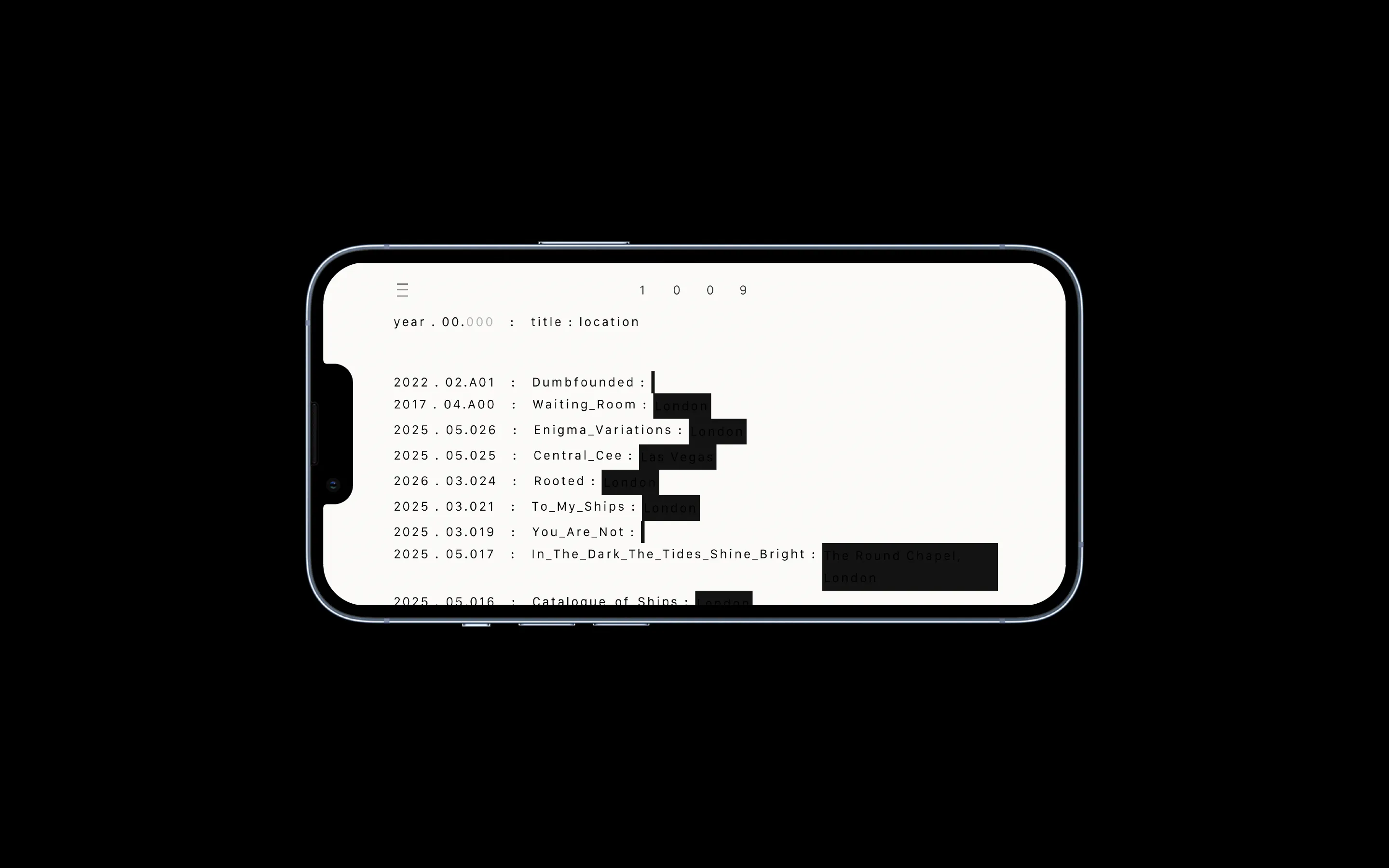
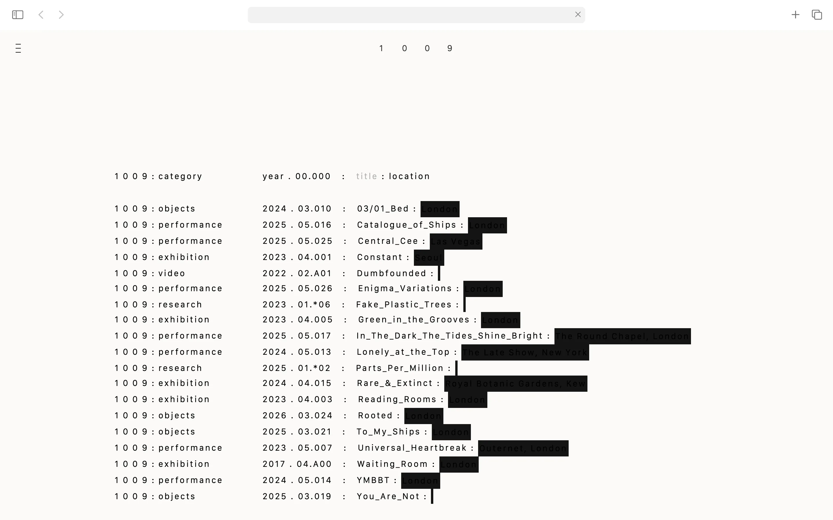
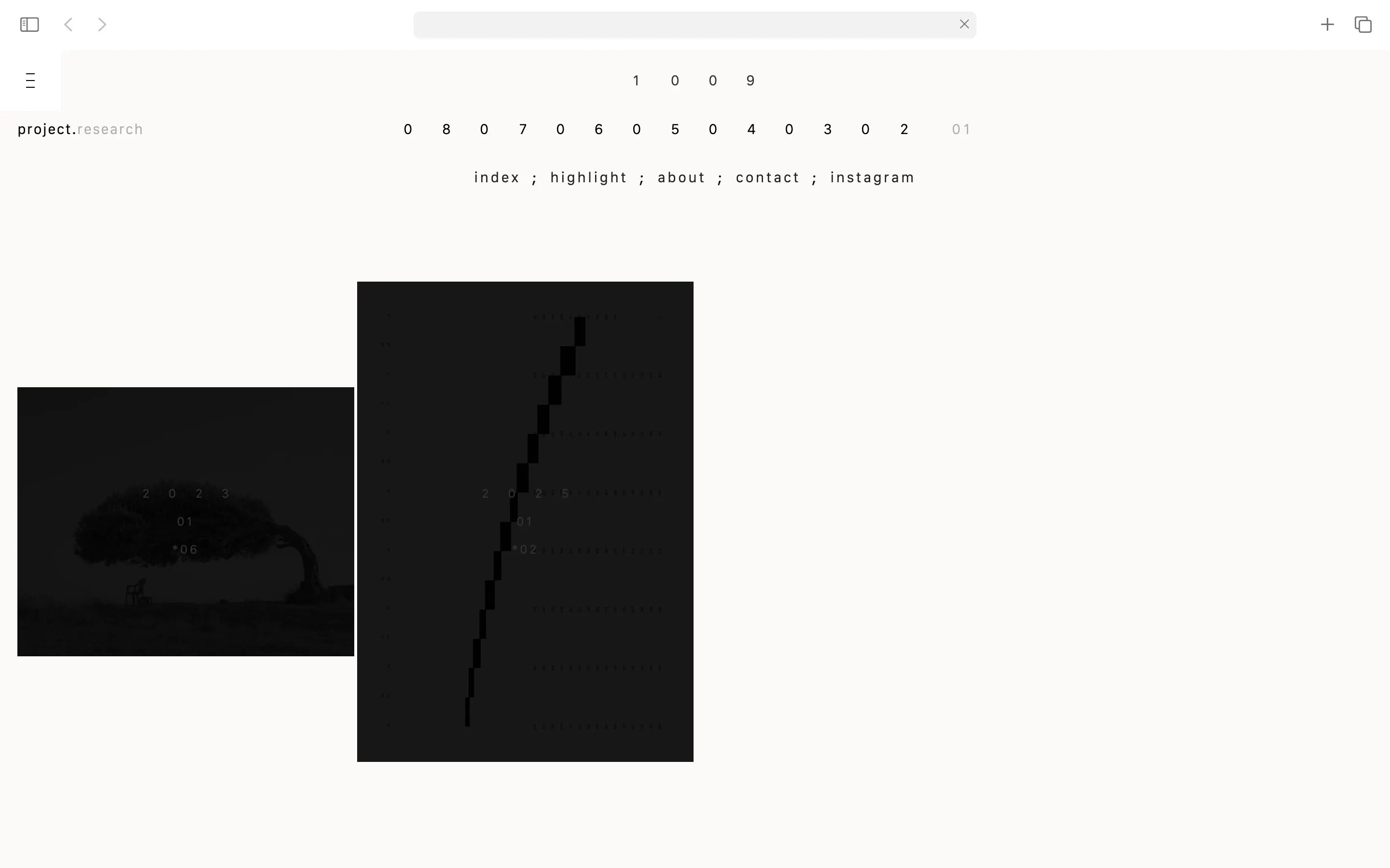
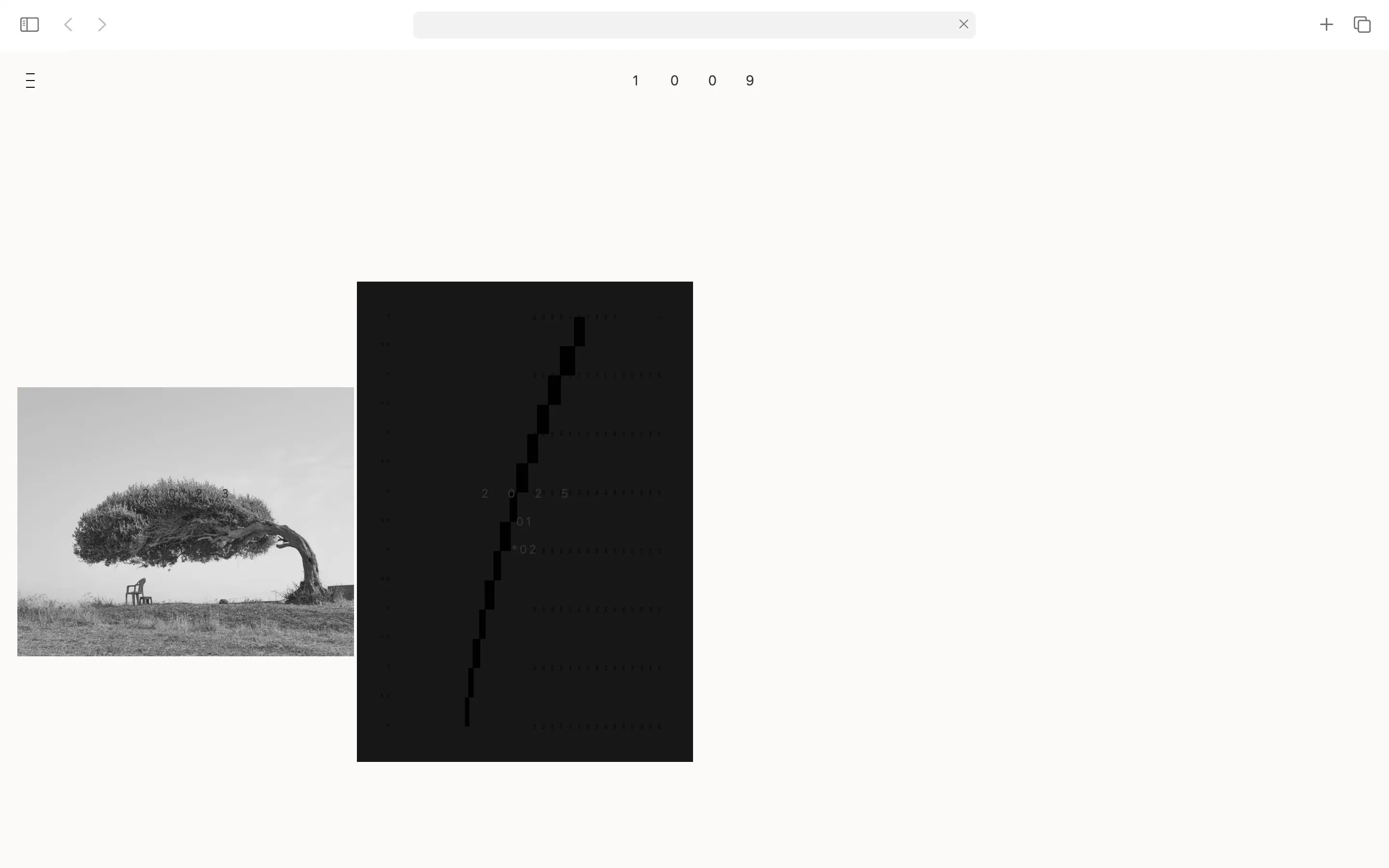
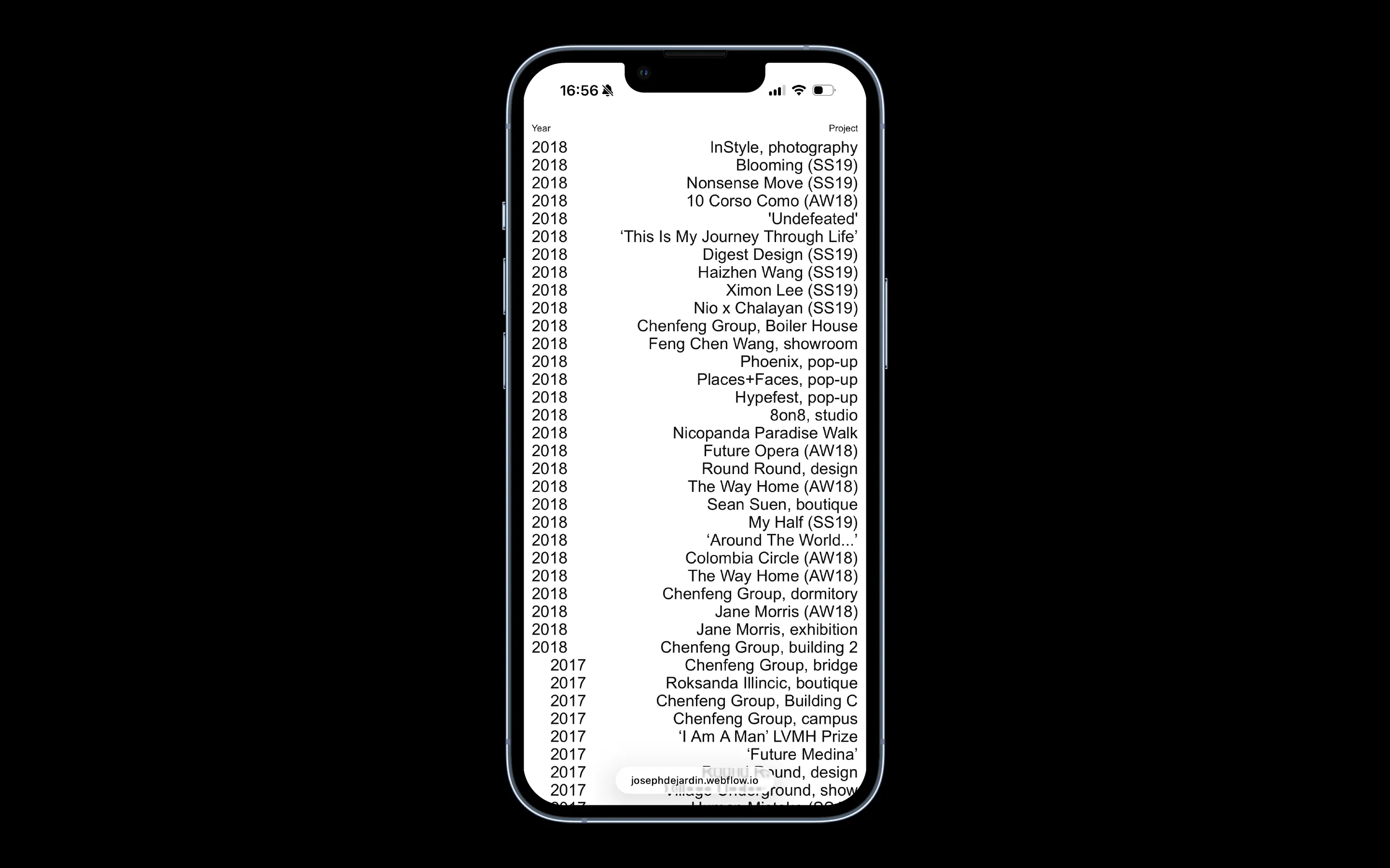
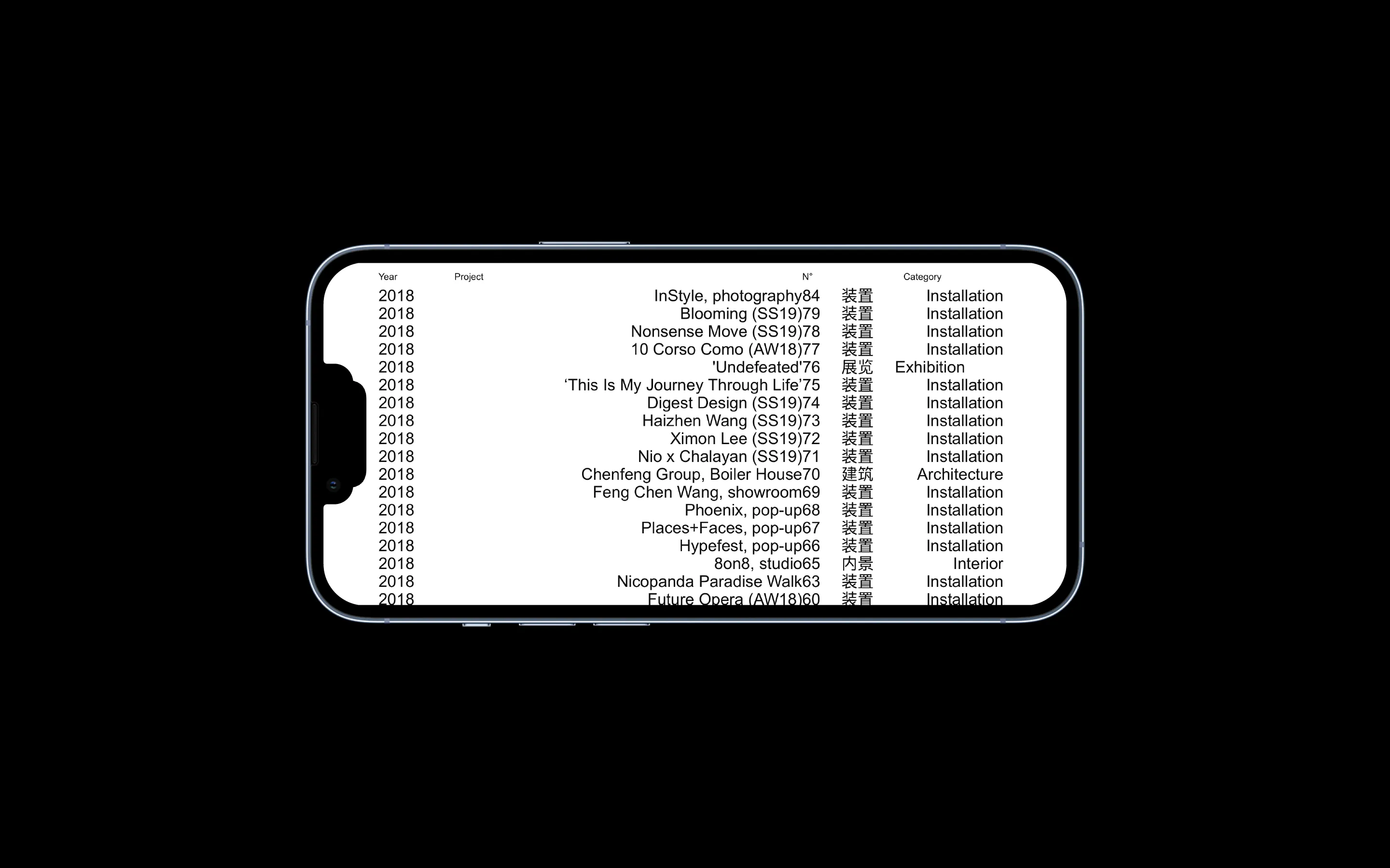
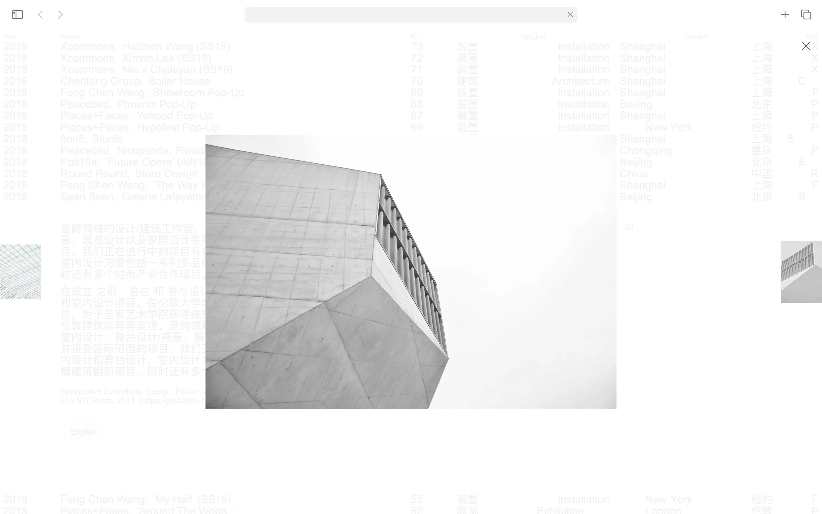
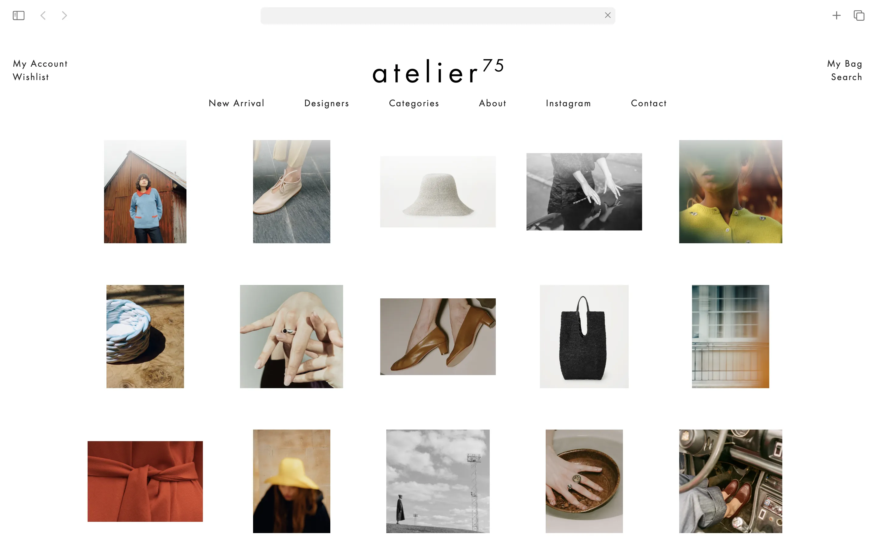
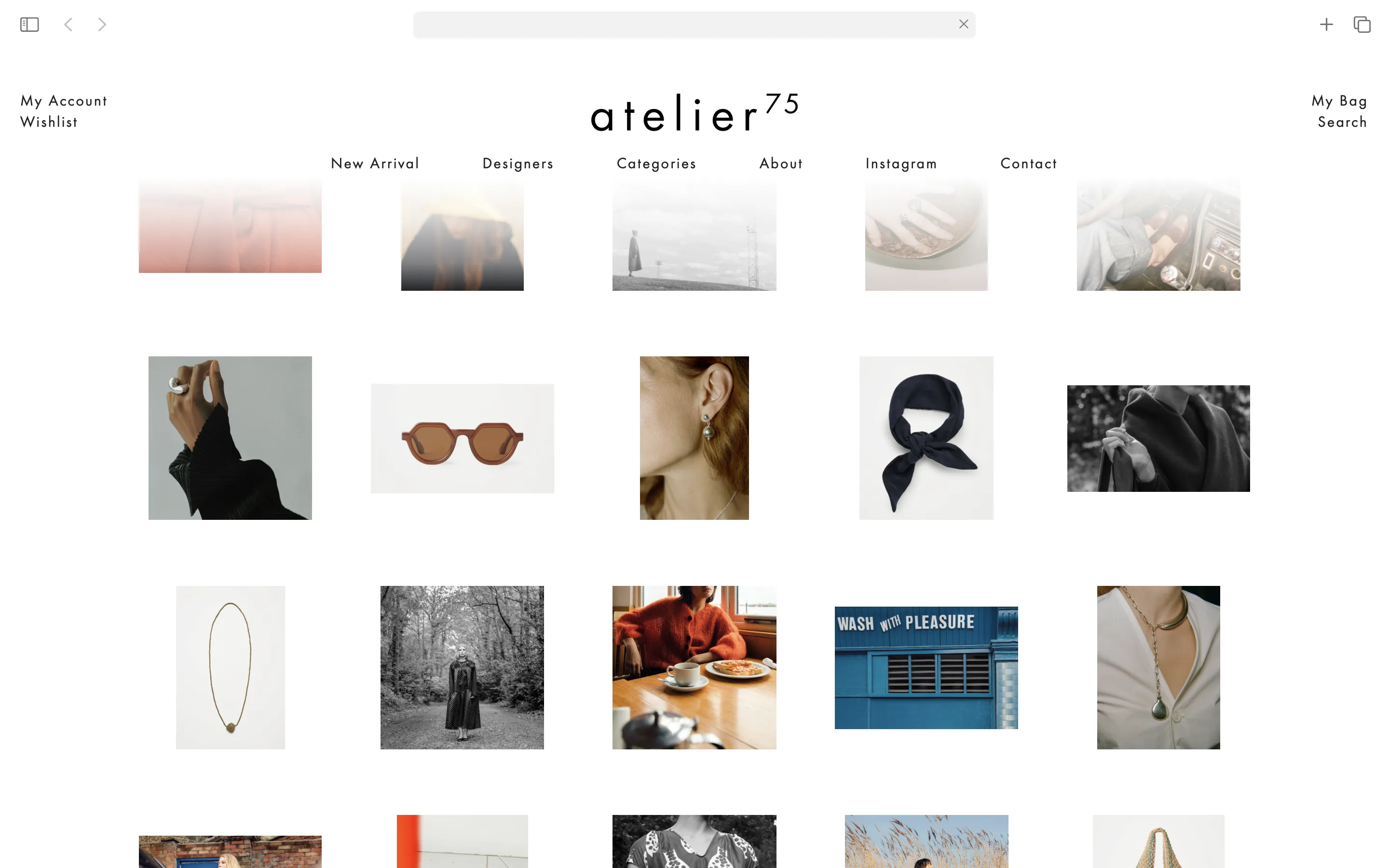
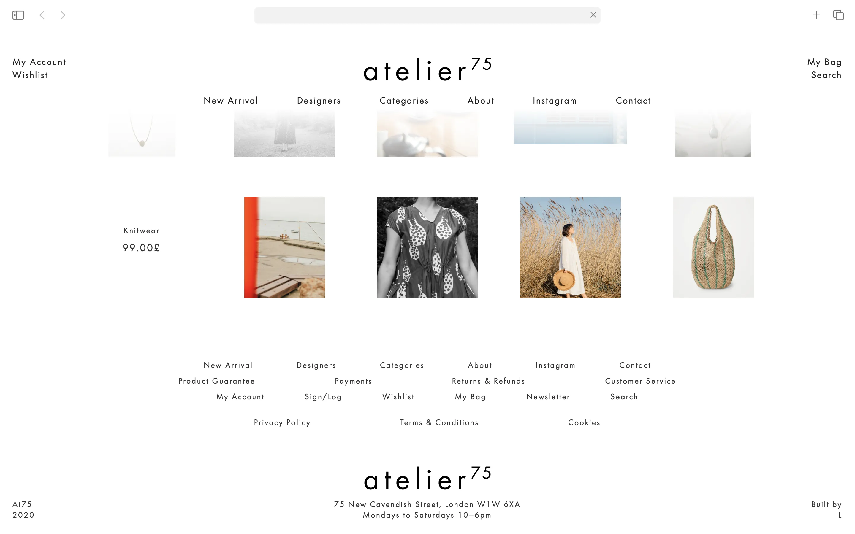
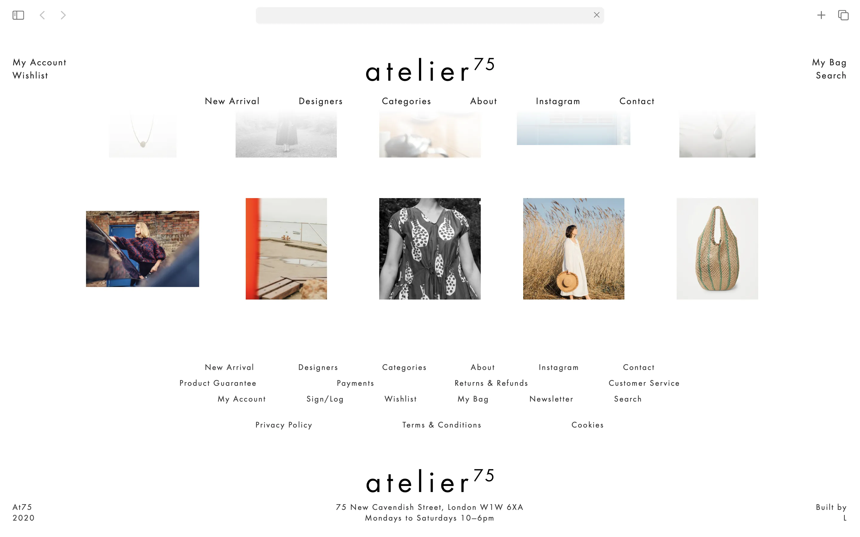
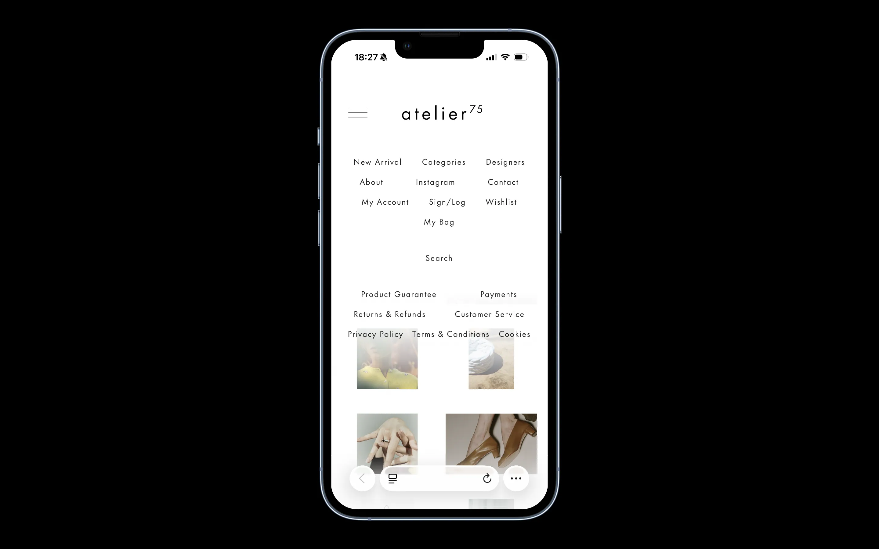
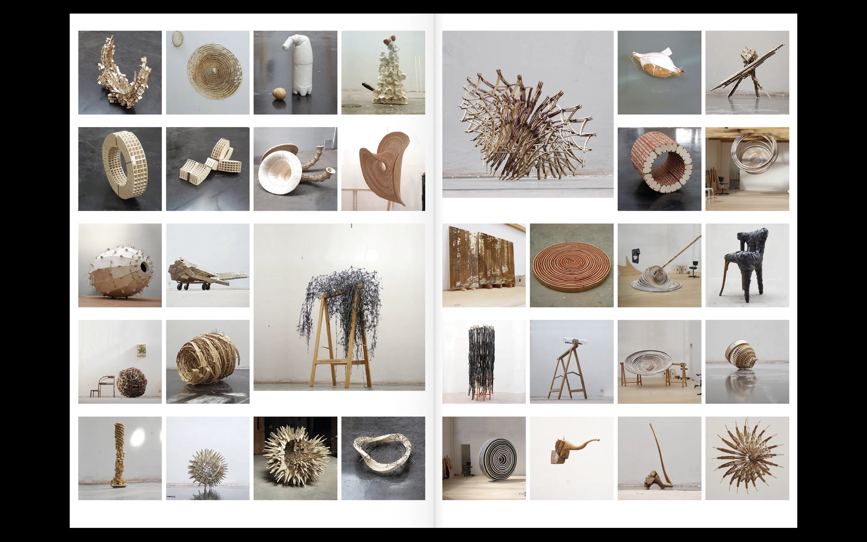
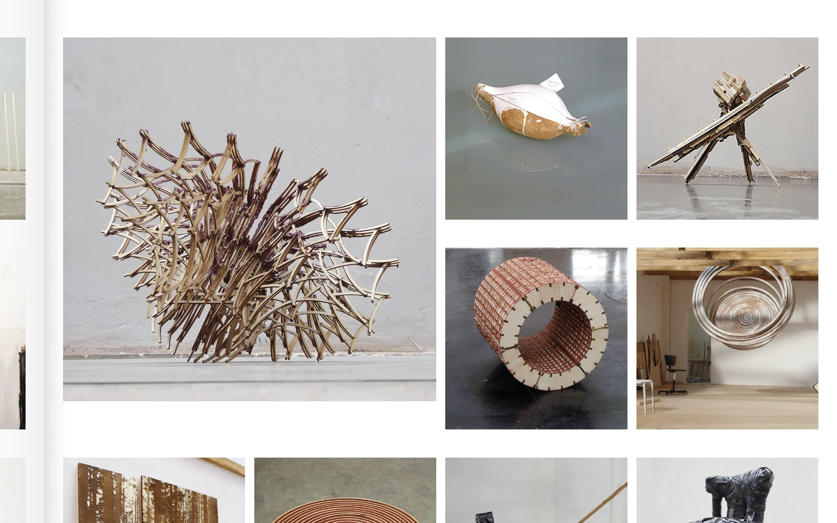
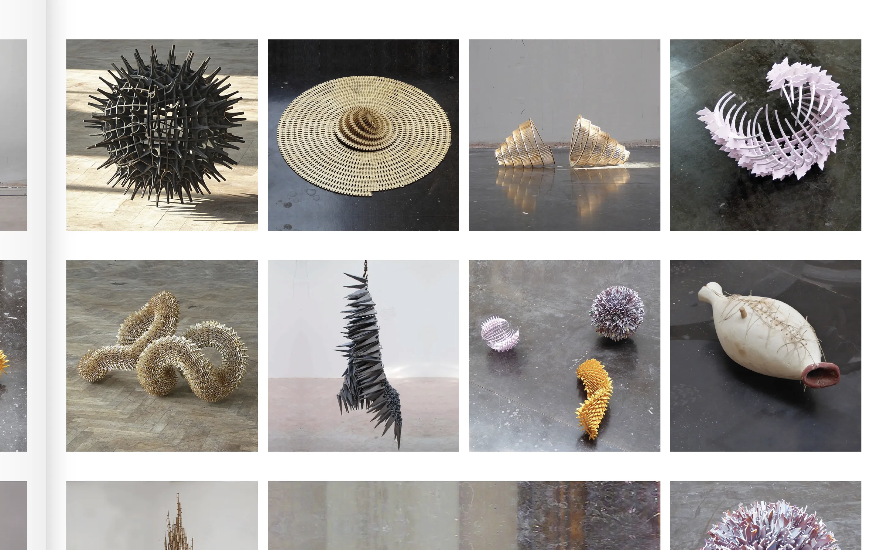
The website is structured around two project views: Highlight (selective view) and Index (comprehensive view). Highlight serves as the homepage, showcasing the studio's current body of work, whilst the Index functions as a codex —— a complete archive where projects are organised through a scale system that mirrors scenographic thinking. Each project's data generates graphic volumes as the user sorts and filters the project list, producing new forms and new spaces to explore.
The CMS is structured around three collections: projects, categories, and status —— archive, completed, upcoming, ongoing, and highlight. Those collections are interconnected while the project collection holds 40 editable fields giving the studio full control over visibility and narrative.
A filtering system enables visitors to navigate by category and status, accommodating different needs across sectors —— from cultural institutions seeking exhibition designers to academic networks interested in their research methodology.
——
* Deliverables:
- Website (design/development)
* Implementation:
- Webflow platform
- Content Management System (CMS) >> 100% editable & customisable
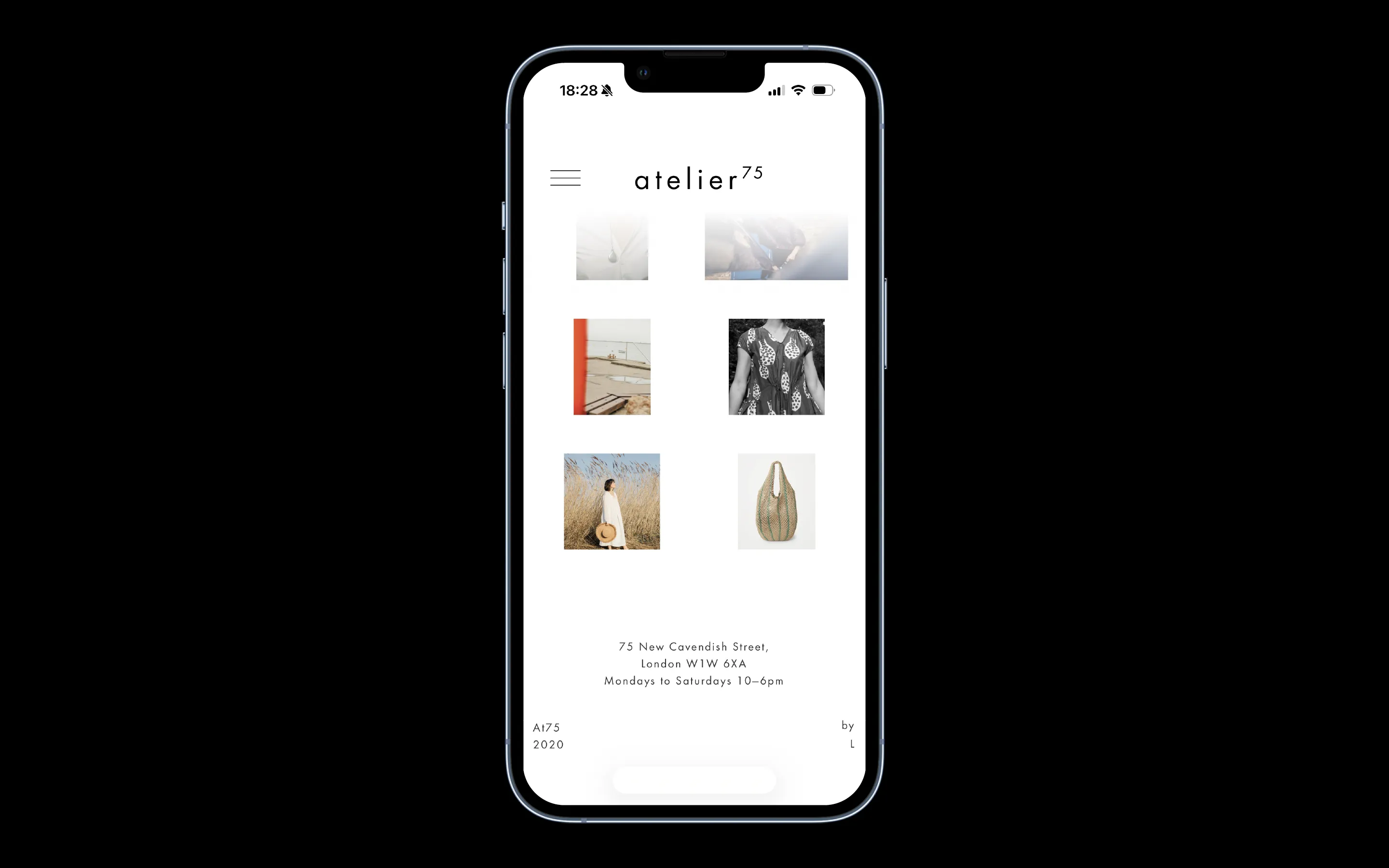
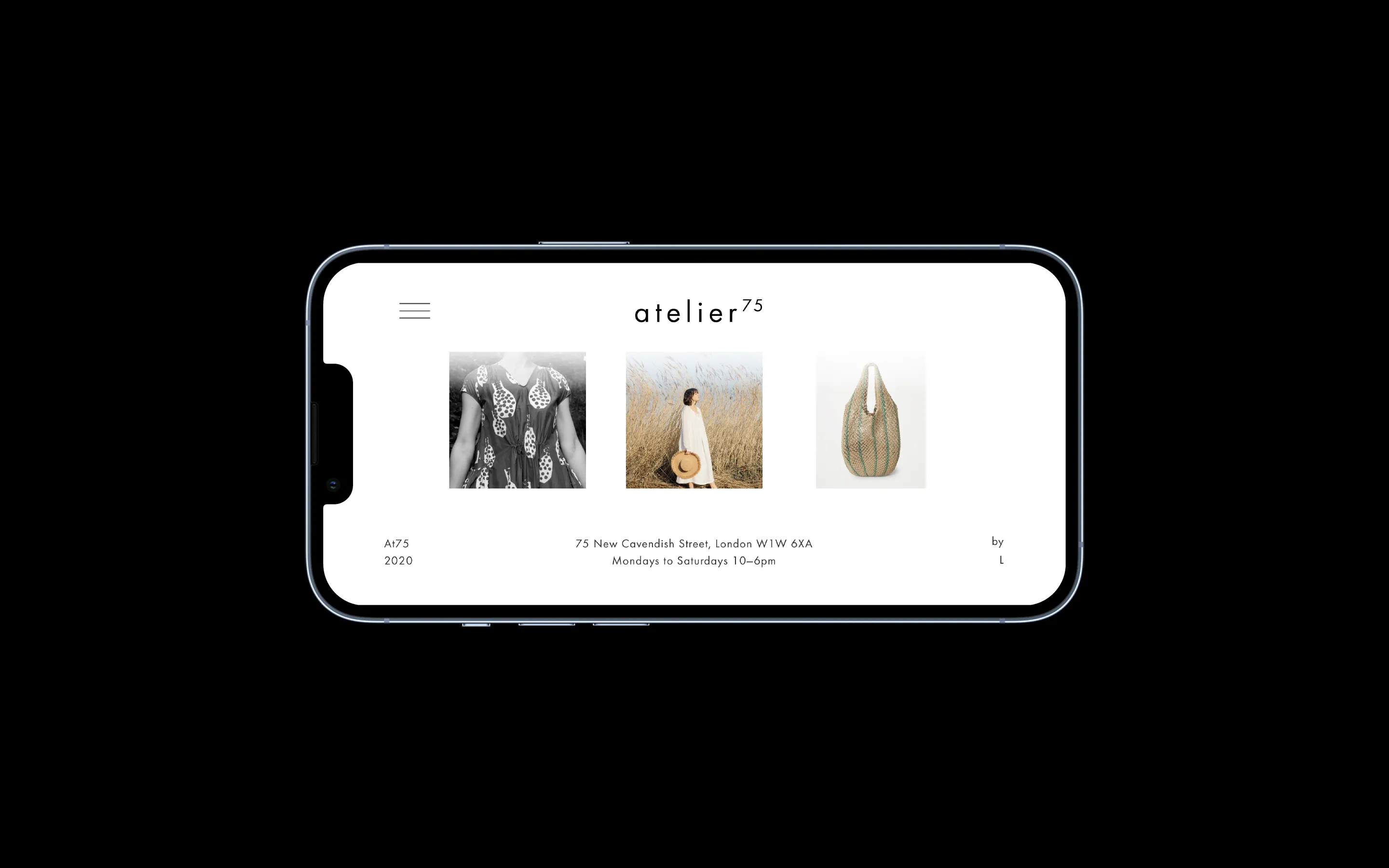
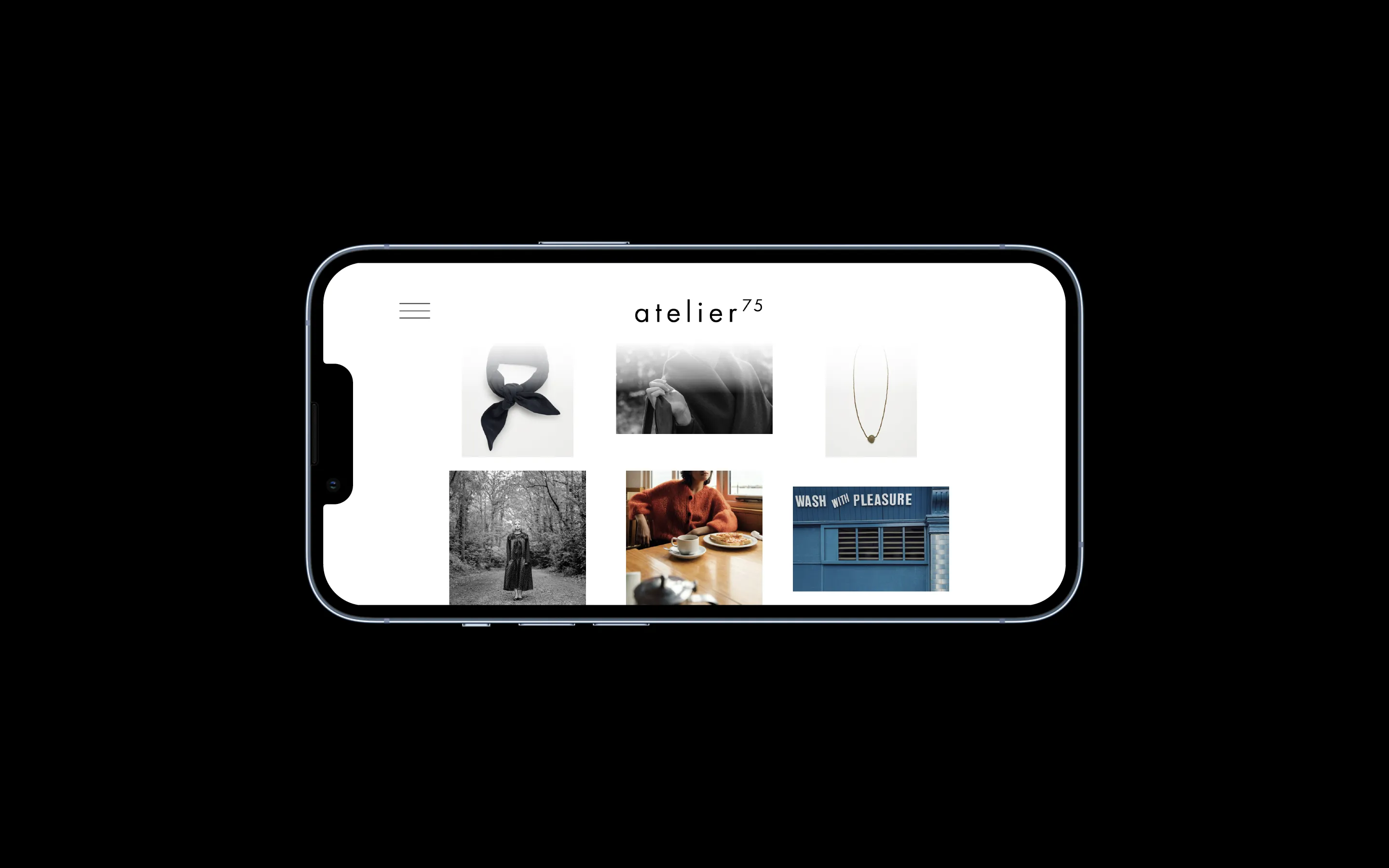
- Responsive design: 6 breakpoints
- Custom components: gallery swiper, dynamic navbar
- Custom richtext editor: extended formatting tailored to the studio's graphic and publishing style
- Custom sorting and filtering systems
- Custom GDPR-compliant cookie consent (Finsweet)
——
* Website: link
> W2:2026 _W1:2025
* W0:2024: link


branding, portfolio & editorial
1 0 0 9 is a scenographic design studio that creates stages, exhibitions, installations and objects. Through storytelling and representation, we aim to challenge conventional perspectives in order to discover new ways of doing things. Teaching and research are a continuous backdrop to our work.
——
* Approach:
- Curating projects through scales
- Customisable communication > 1 0 0 9 as the editor
* Audience:
> Creative: Architecture, Art & Design, Cultural Institutions
> Editorial: Research & Publishing
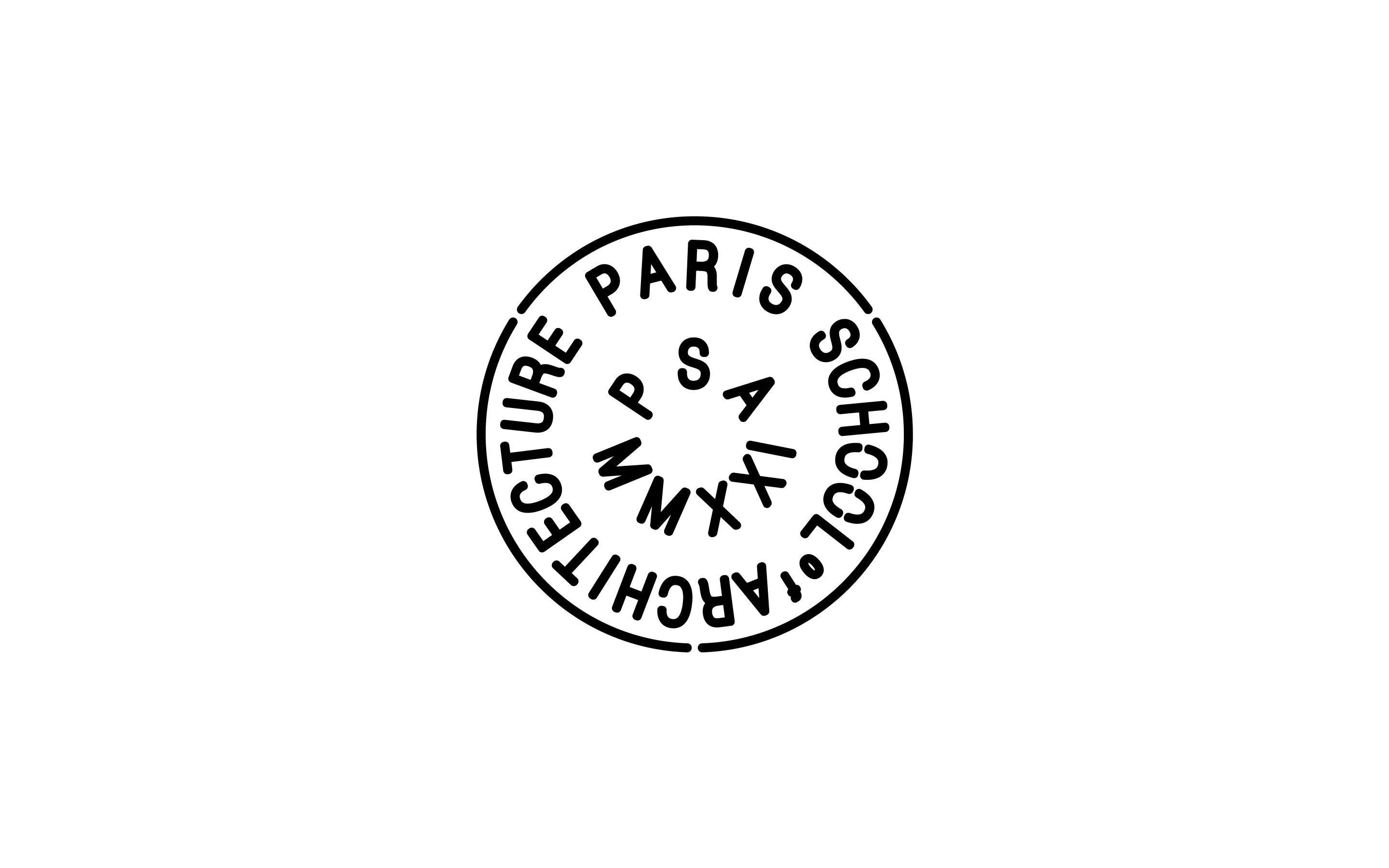
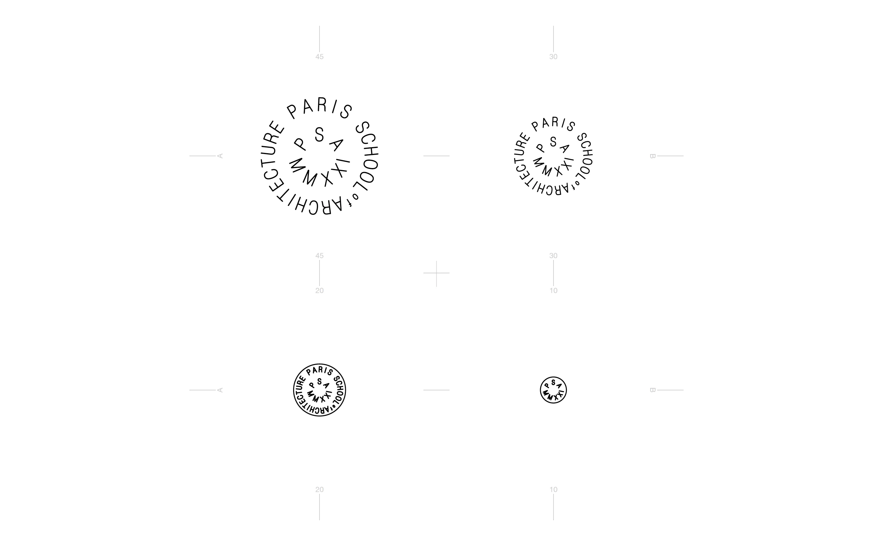
1 0 0 9 > 10 09 > 08 07 06 05 04 03 02 01
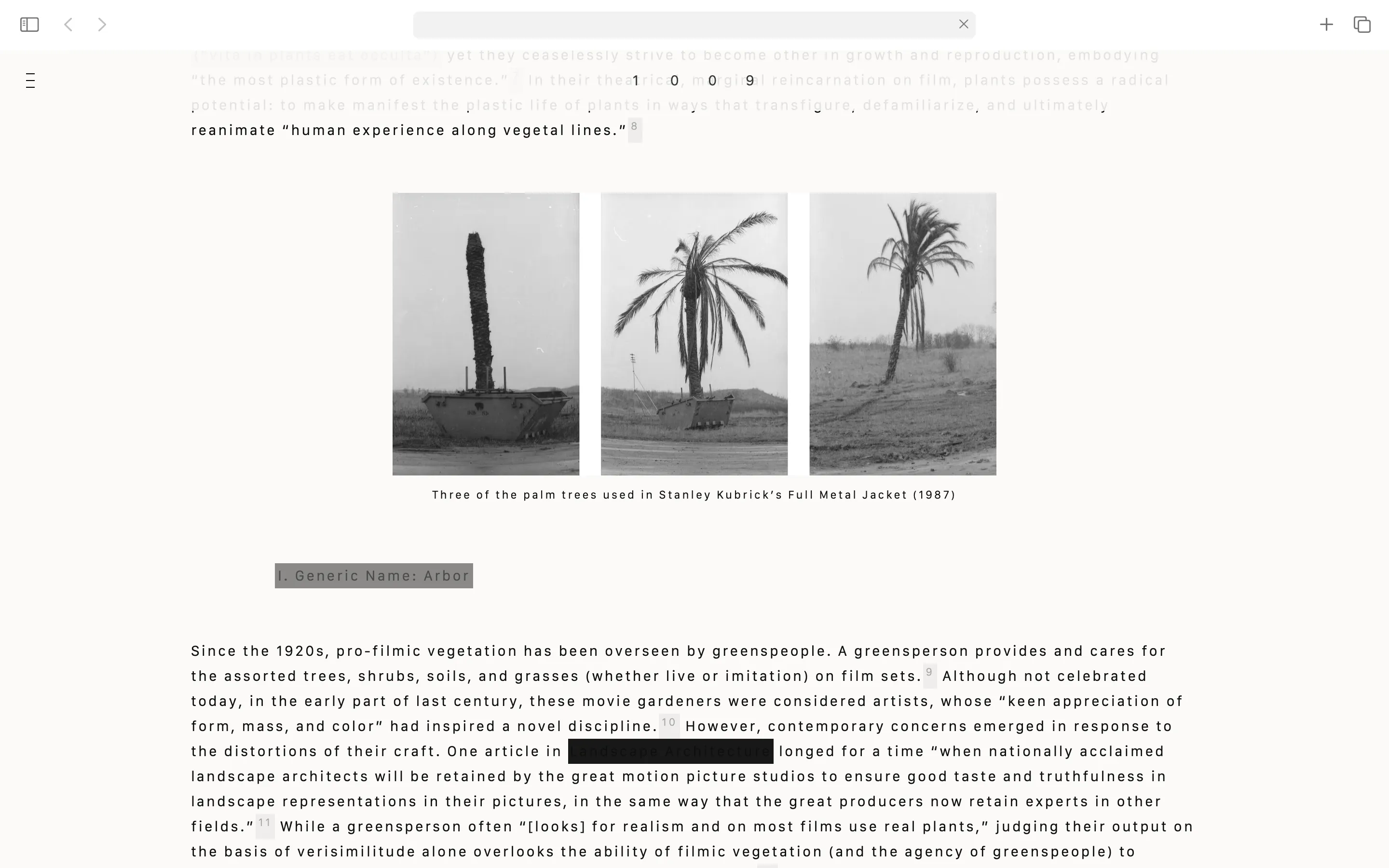
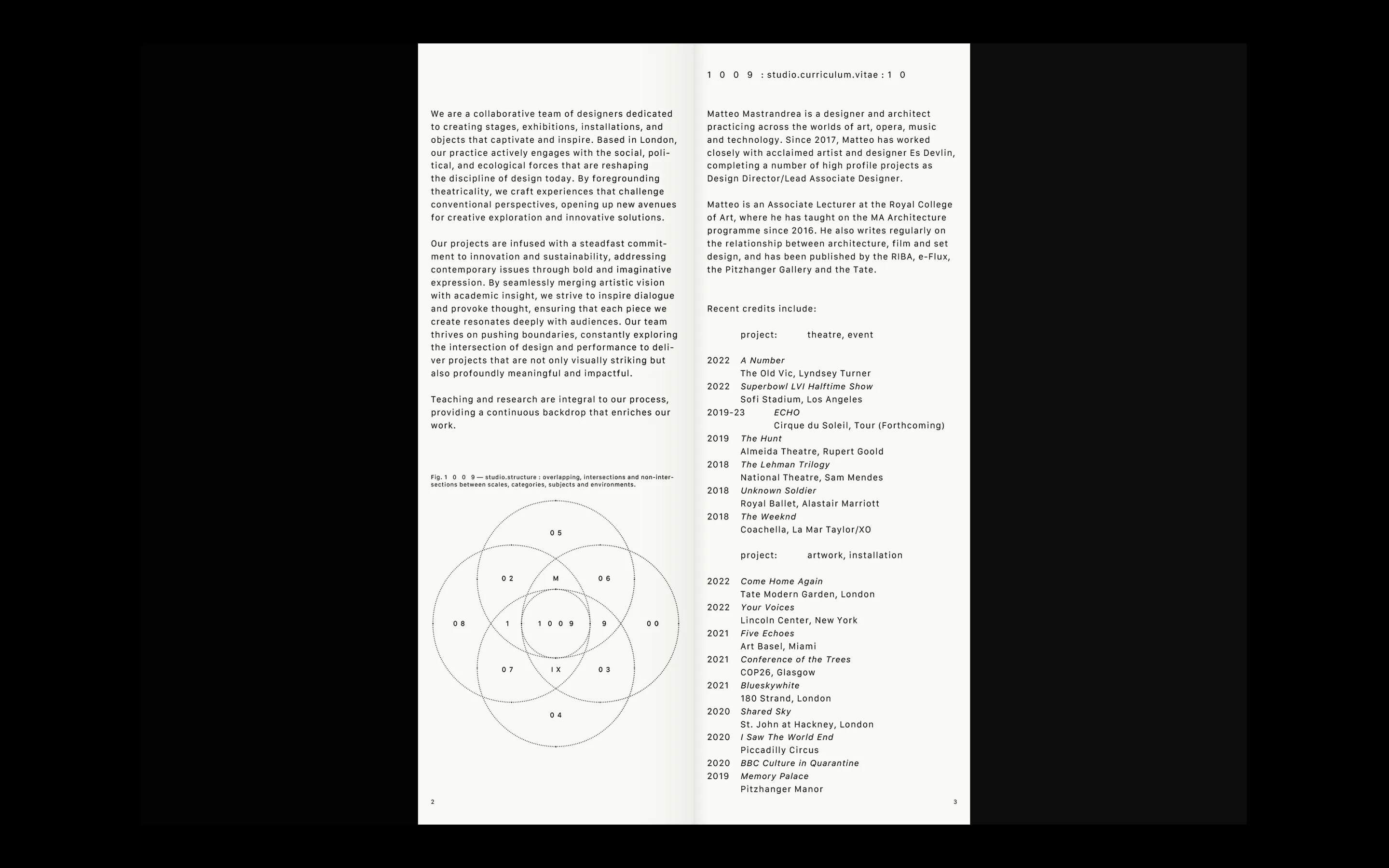
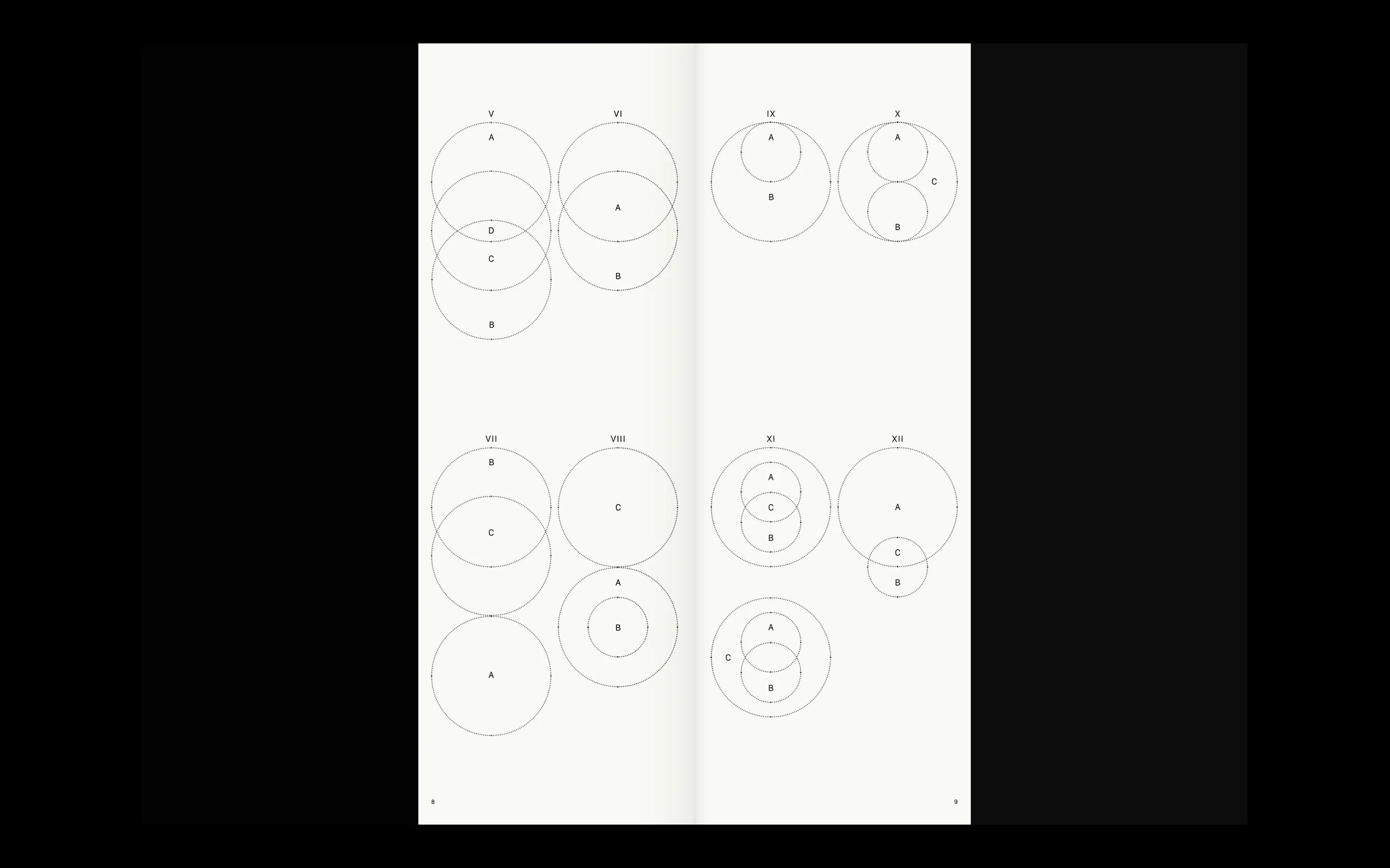
1 0 0 9 is two architects (10 09) developing projects organised through scale —— from earth (08) and cities (07) down to objects (03) and research (01). The graphic language is generated from this framework —— project data, categories, and scale become visual material, drawn from maths, indexes, and library conventions to create a system that is encoded yet functional.
Two portfolio templates were designed to serve different contexts.
The standard template is a single format with transparent inserts between projects creating rhythm and room for the reader to pause. By contrast, the fragmented template breaks across multiple formats —— a structural echo of the studio's scale system —— each project individually curated to reflect their DNA as researchers and curators. Both templates function as printed and digital documents, giving the studio full control over how they present their work.
* Editorial:
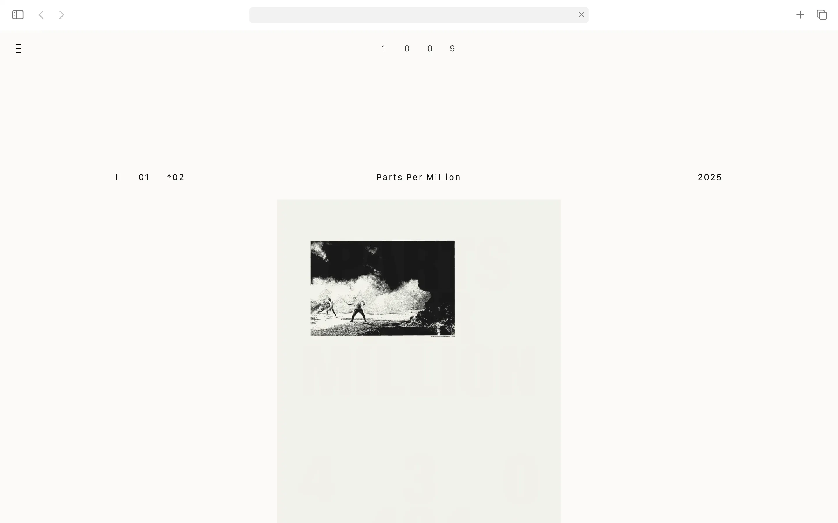
> Parts per Million
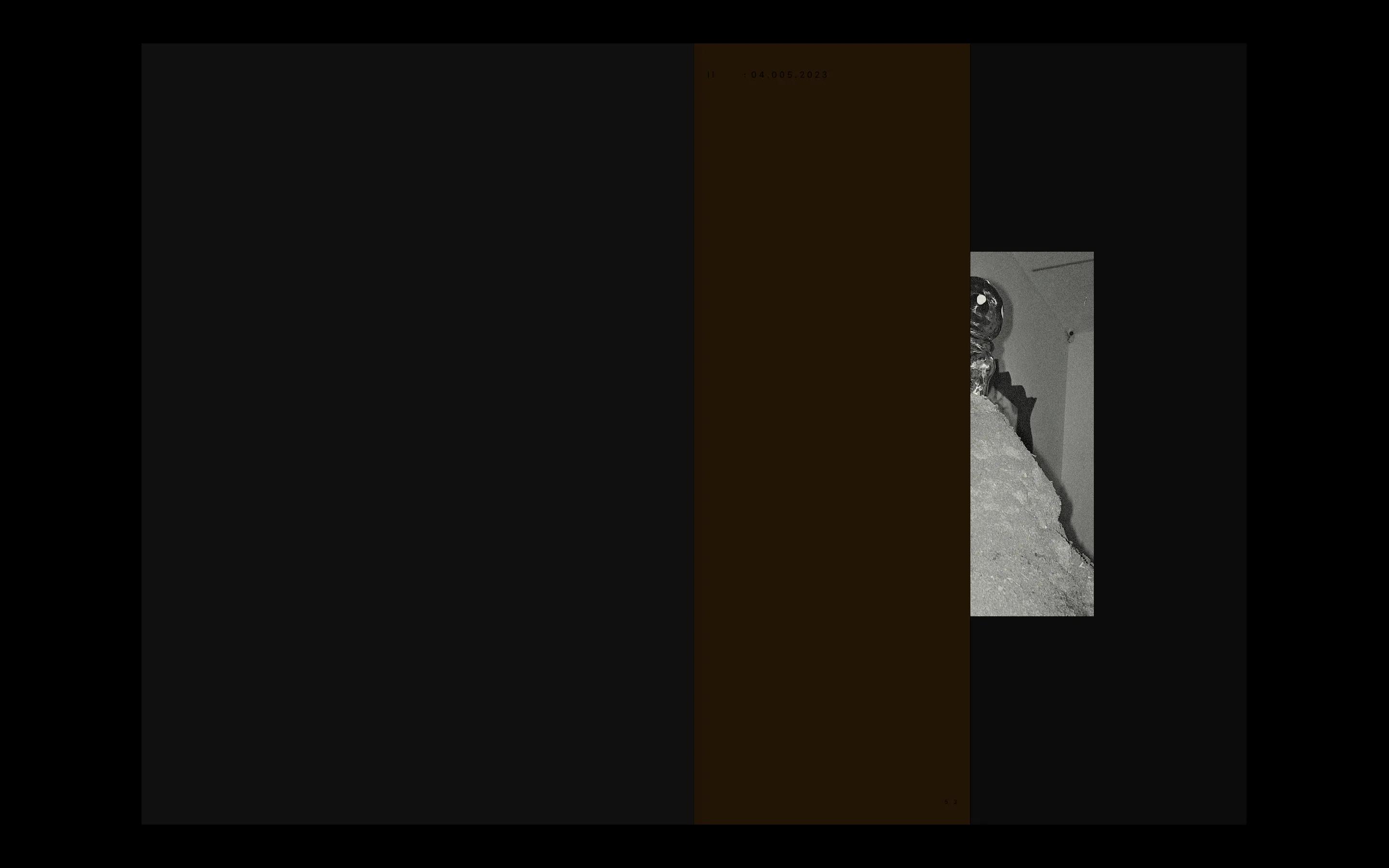
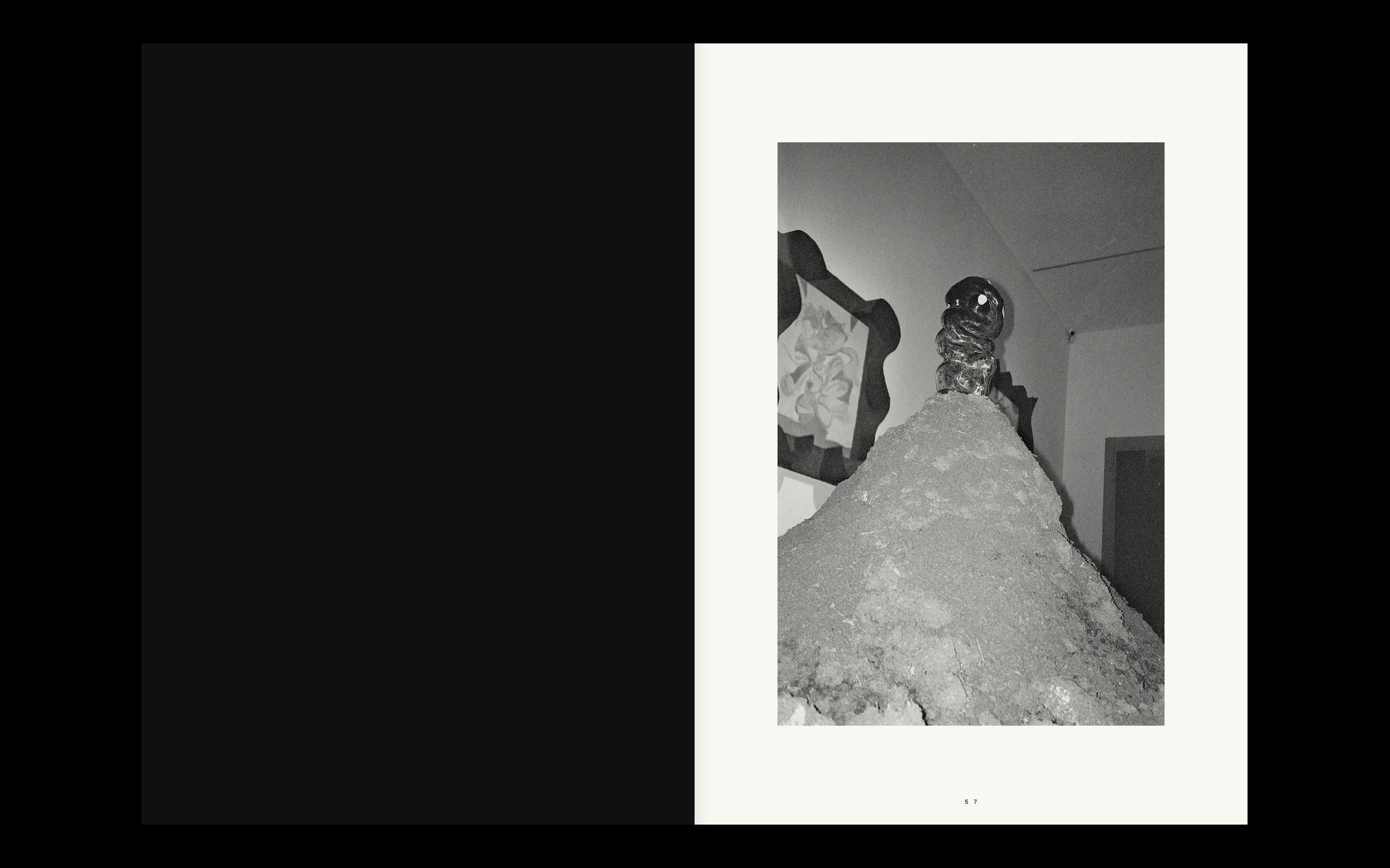
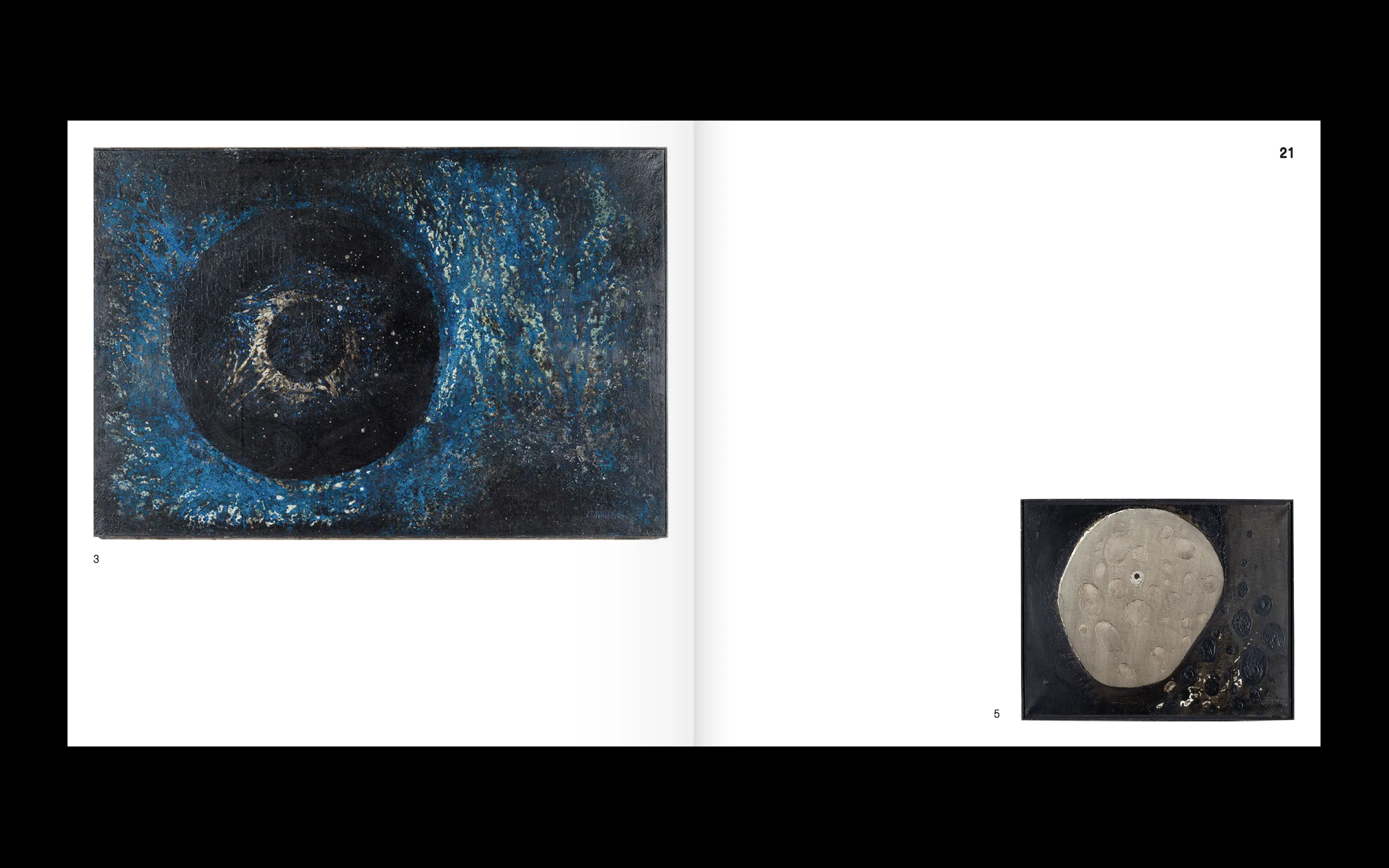
Parts per Million is a book-object for 1 0 0 9's ongoing research series exploring key dates in the climate crisis. Each piece in the series relates to a particular media outlet and takes a different form of media —— from radio to television to print. The publication focuses on the New York Times —— gathering front pages from significant dates into an archival folio that can be read from multiple angles.
Each key date is presented across two pages —— the New York Times front page paired with a data visualisation of the evolving situation. A grid page lists every parts per million value from 316 to 424, each number becoming a black mark with its date. By the time the reader reaches 424, the page is nearly solid black.
The 430 threshold —— the point of no return —— marks the limit.
The Keeling curve runs along the spine. A secondary visualisation emerges on the bottom edge, generated by a heading system combining parts per million values with their dates (e.g. 323, 14.04.65 _ 356, 22.04.89 _ 422, 28.02.23) —— the consistent placement of day, month, and year draws a secondary pattern along the edge.
The object offers multiple points of entry to reading and travelling.
——
* Deliverables:
- Branding
- Portfolio template, standard (print/digital)
- Portfolio template, fragmented (print/digital)
- Editorial: Parts per Million
+ Custom Production: Bookbinding & Letterpress
——
* Article: The Architecture of a Branding
* Website: link
branding, editorial & website (design/development)


branding, logotype & typography
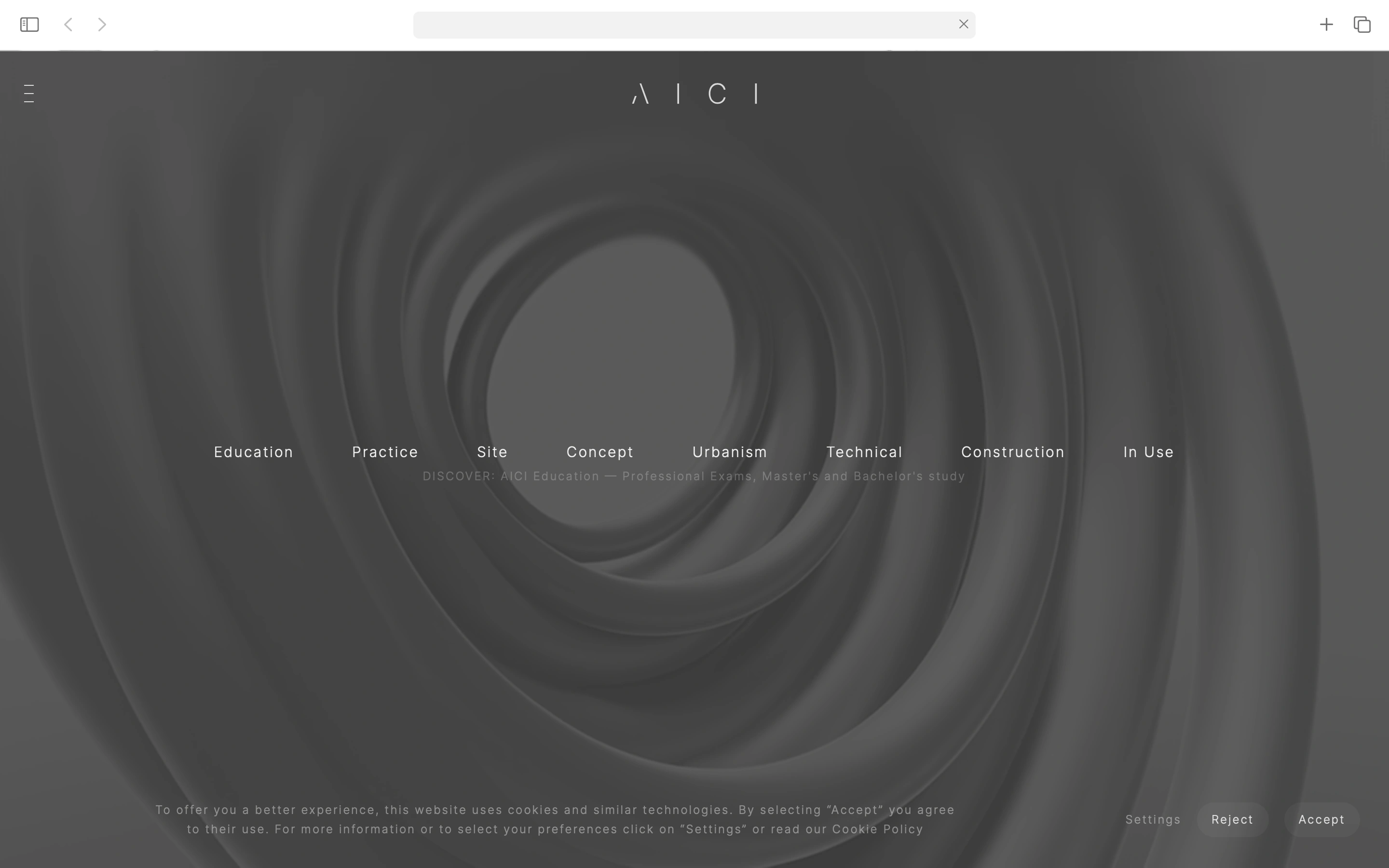
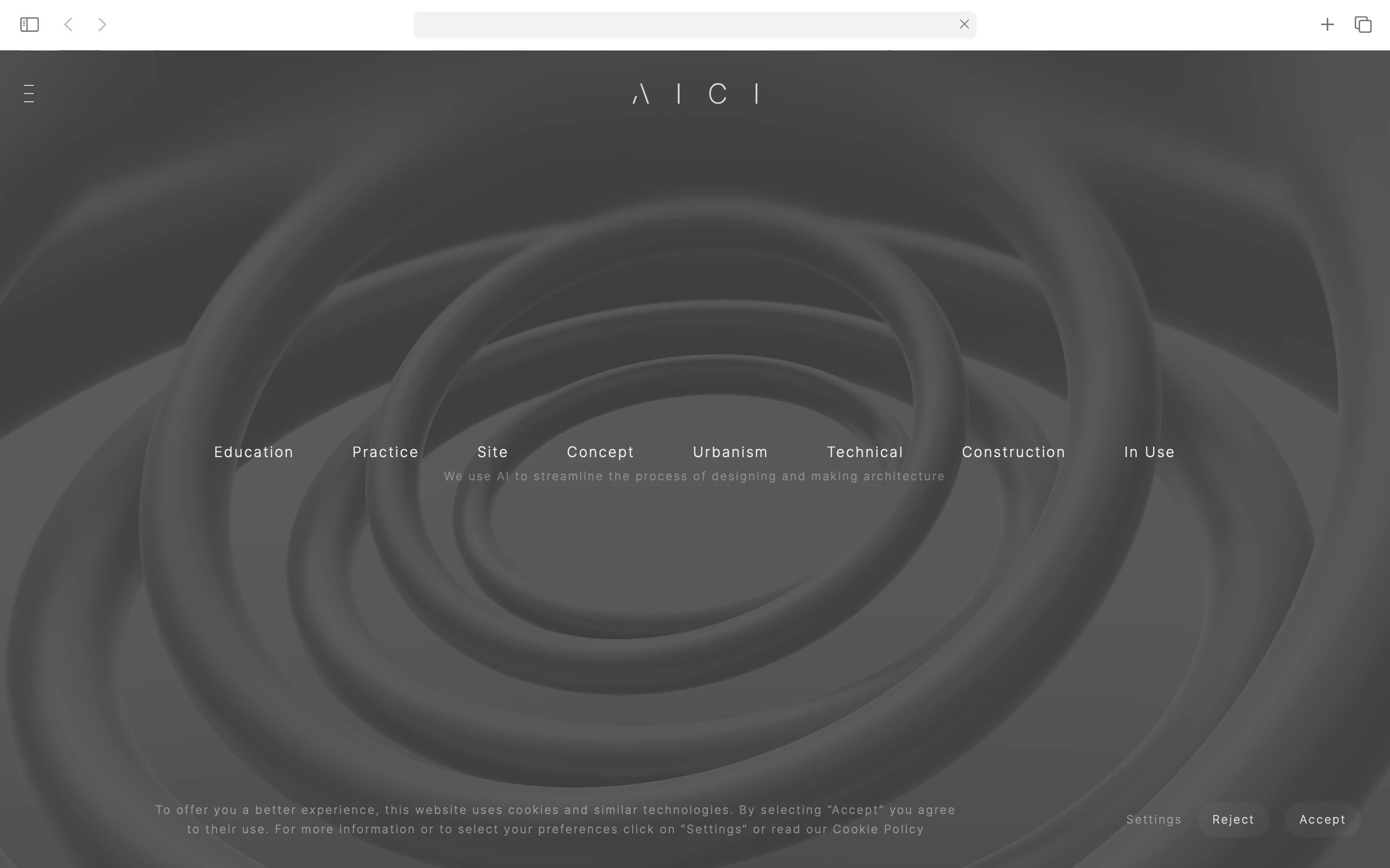
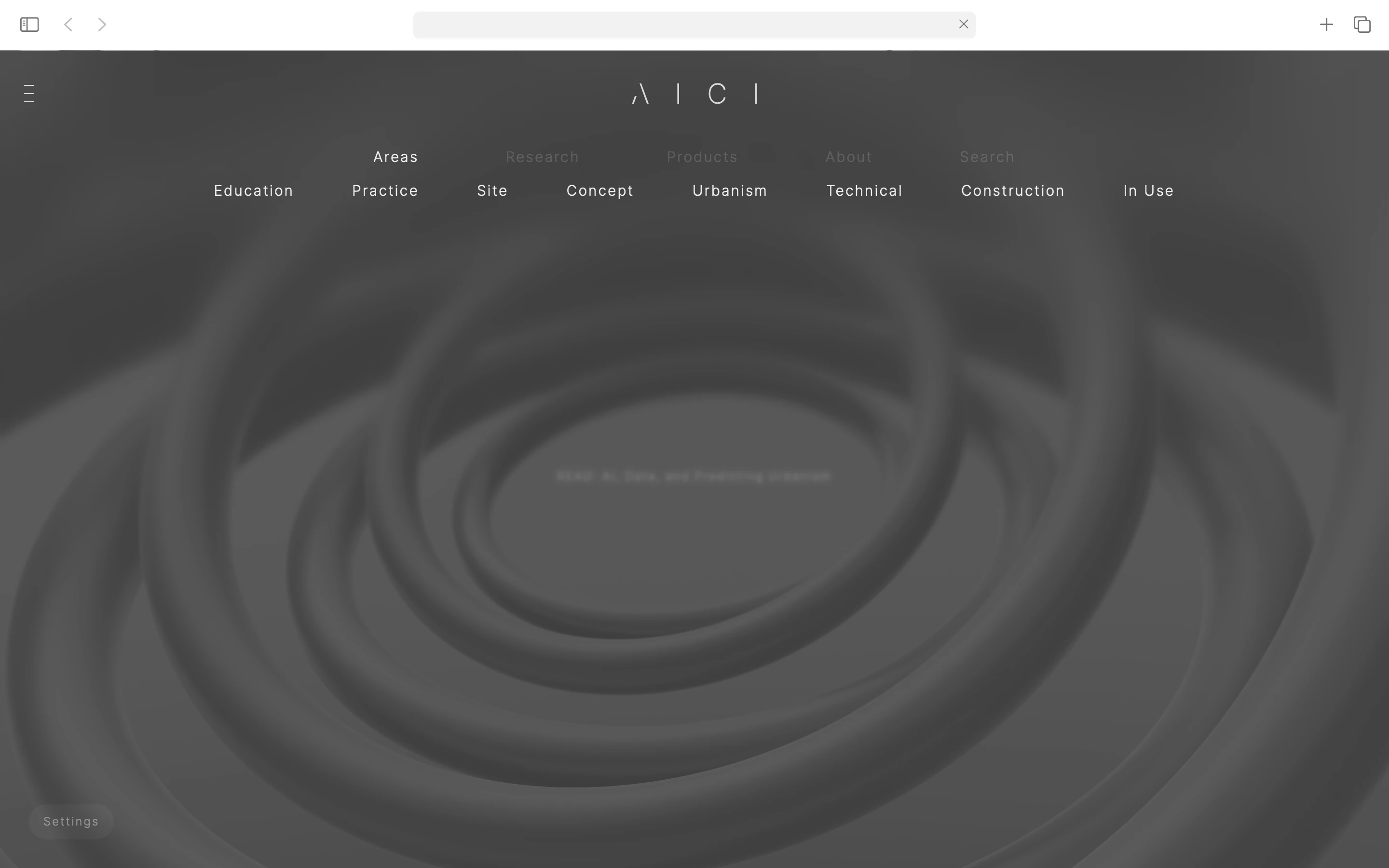
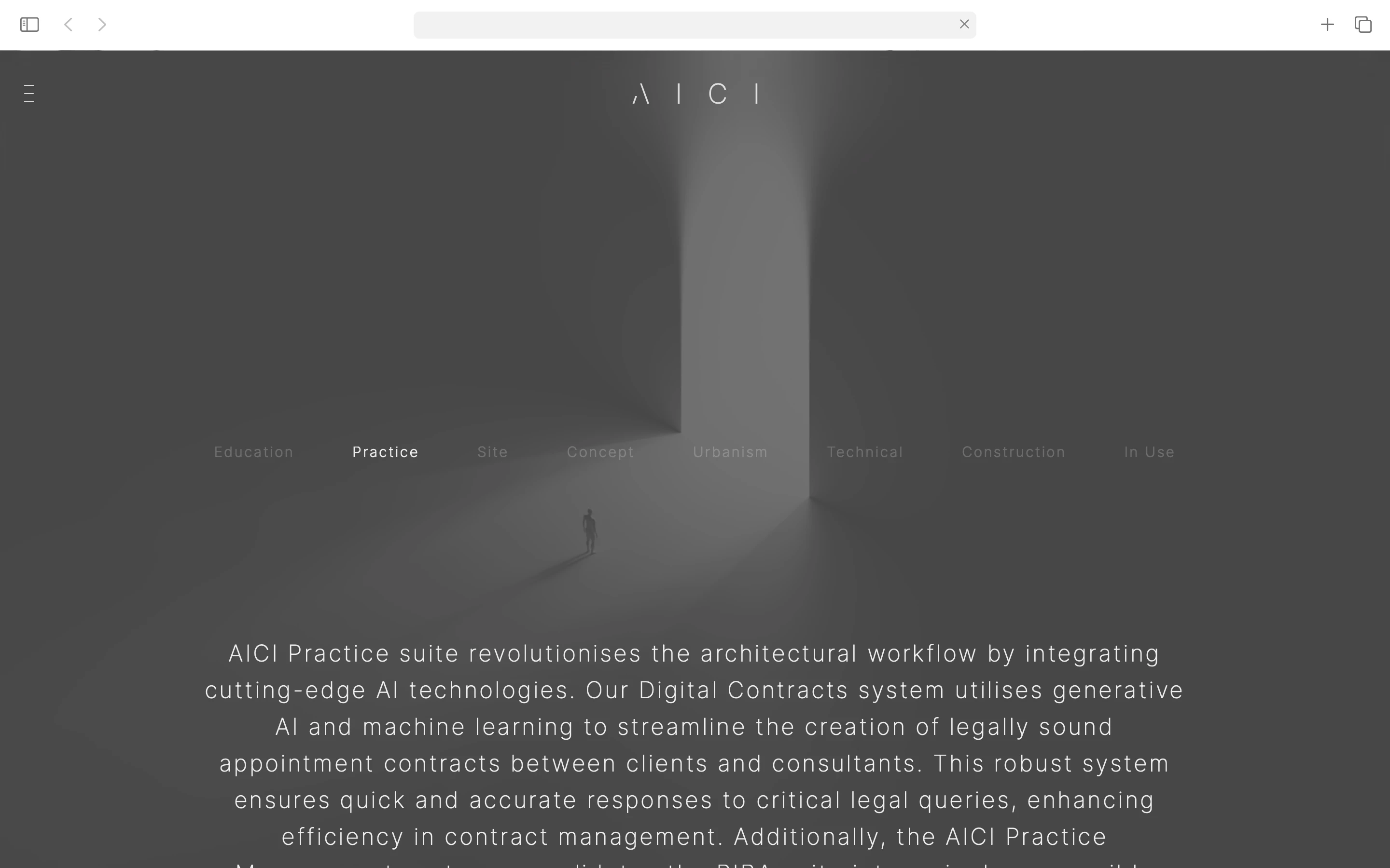
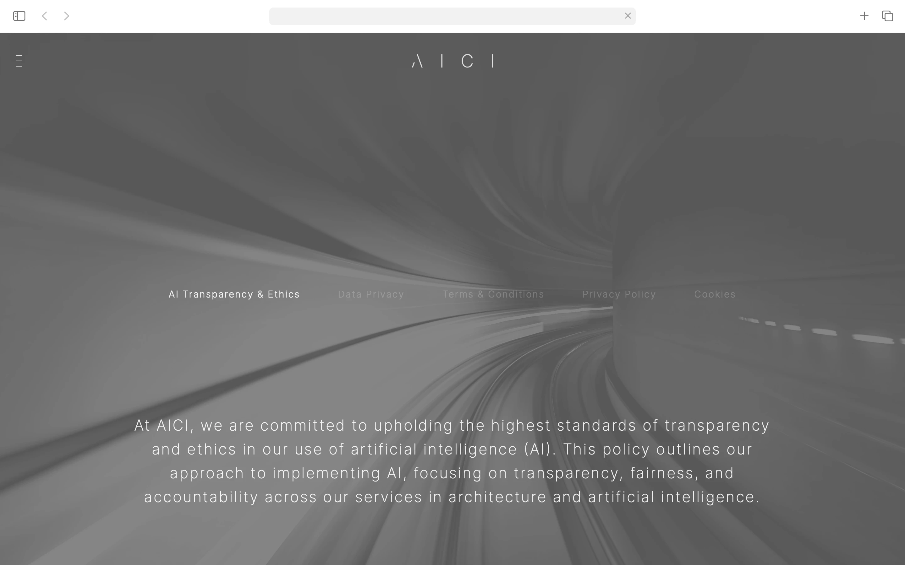
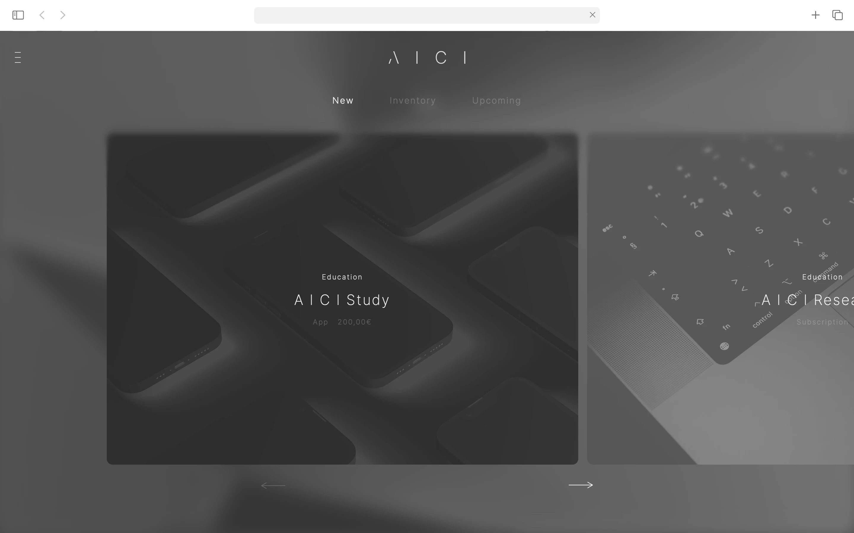
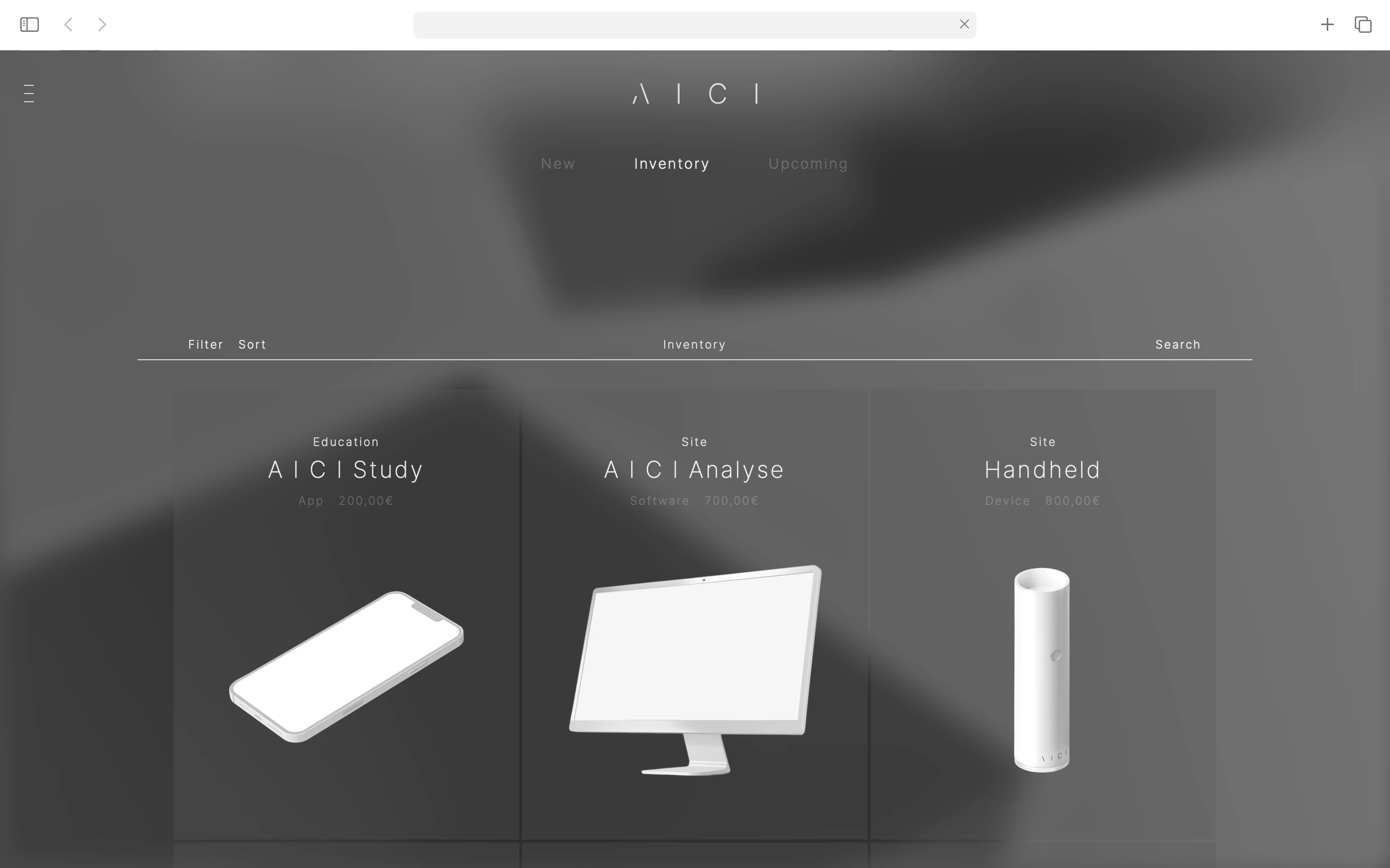
AICI is a tech company developing innovative products for the complete architectural project lifecycle: Site, Concept, Urbanism, Technical, Construction, and In Use —— spanning Education, Practice, and Production. With a strong focus on research, AICI ensures that its products are built on a foundation of knowledge and understanding of the industry's evolving needs.
We use AI to streamline the process of making and designing architecture
——
* Approach:
- An immersive journey in Architecture(s)
* Audience:
> Primary: Architects (Professionals, Academics & Students)
> Secondary: Architecture-adjacent fields
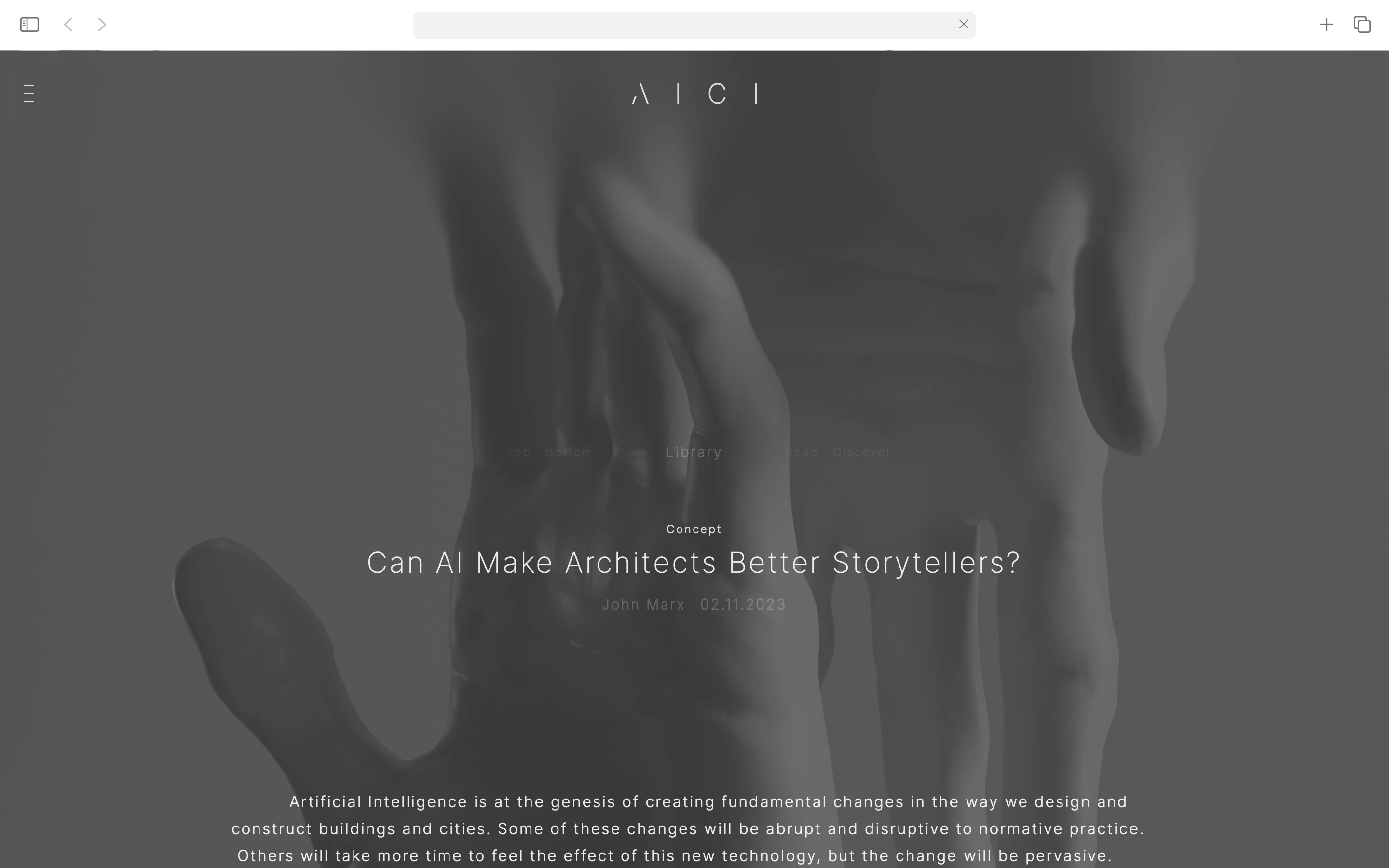
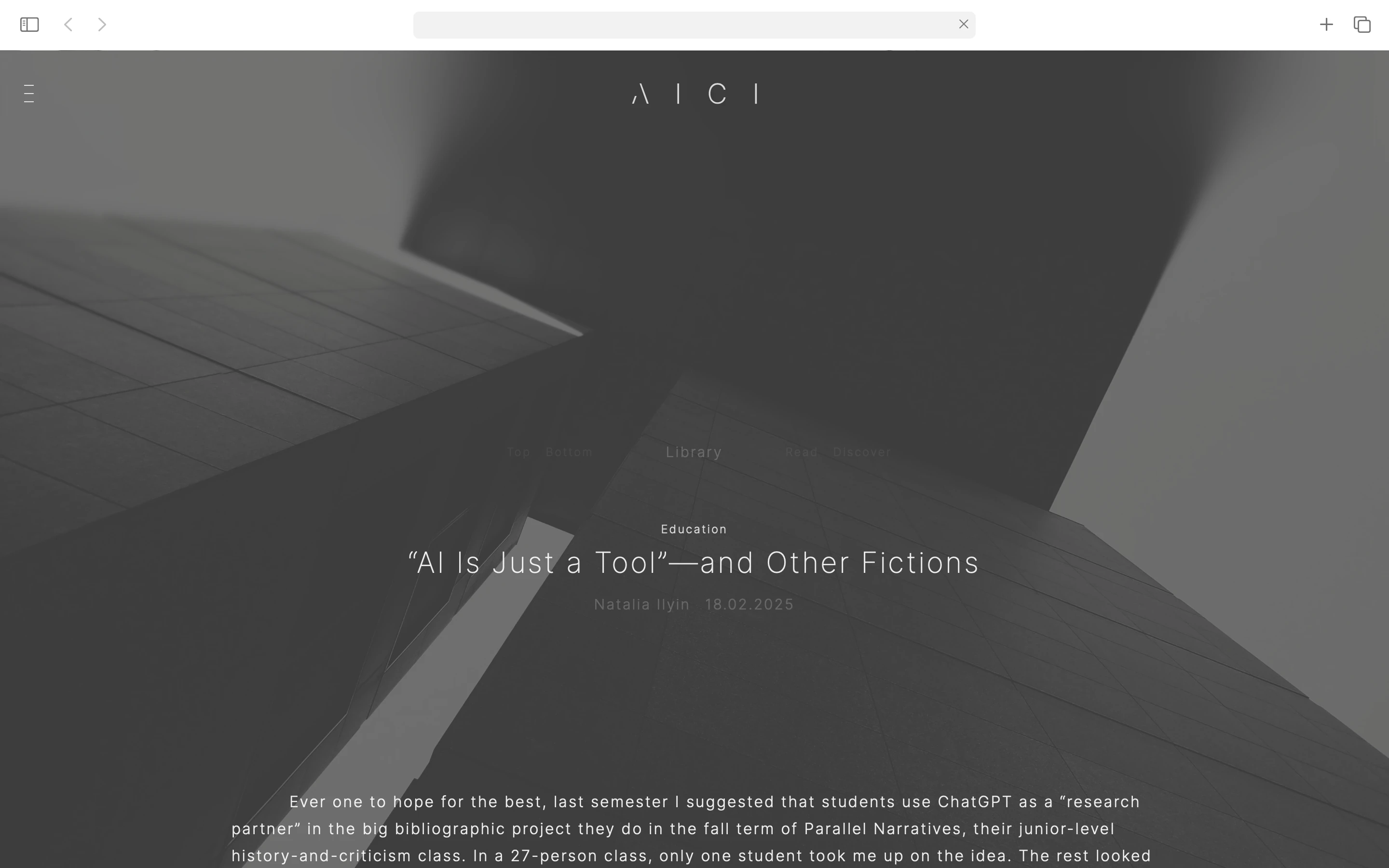
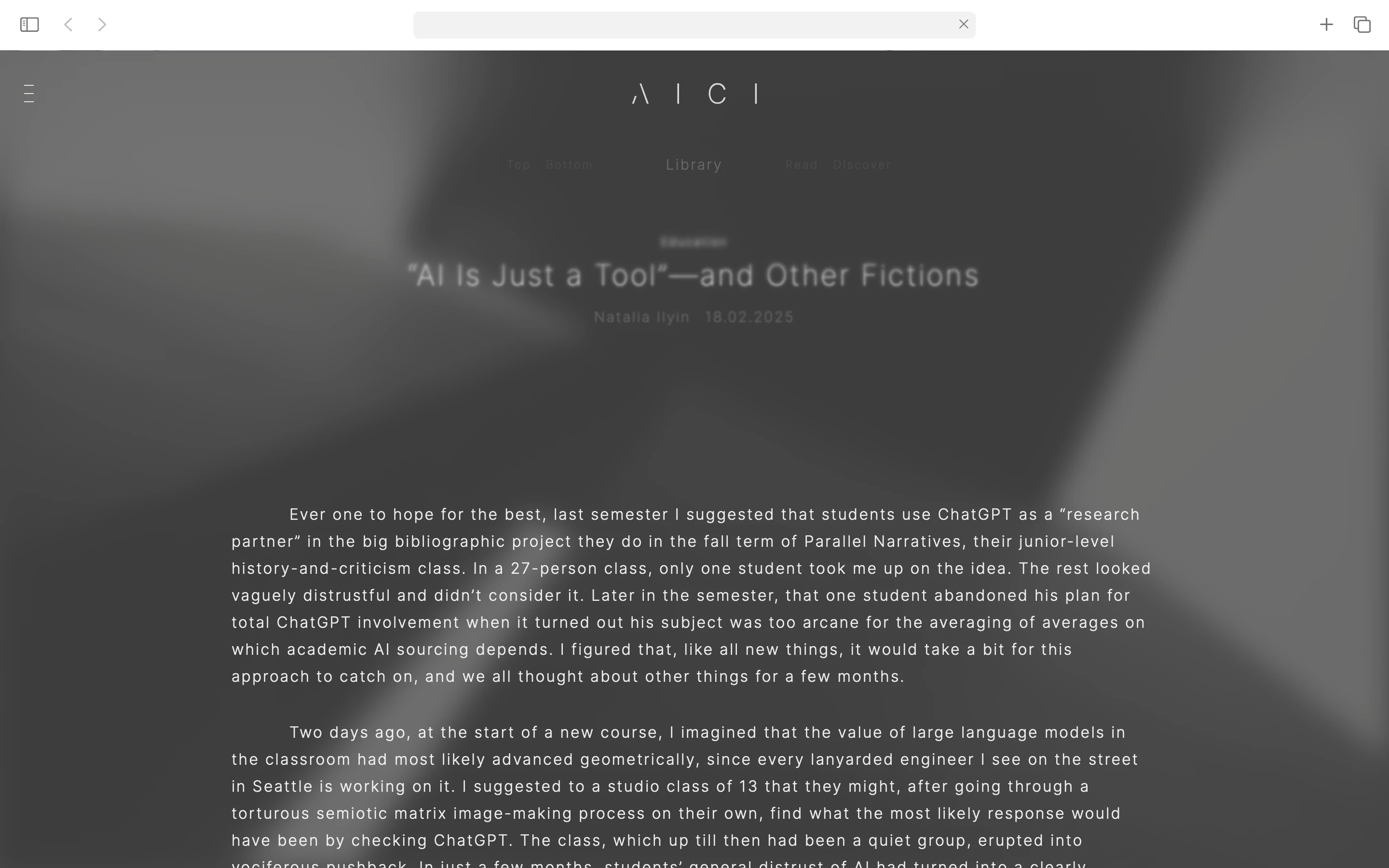
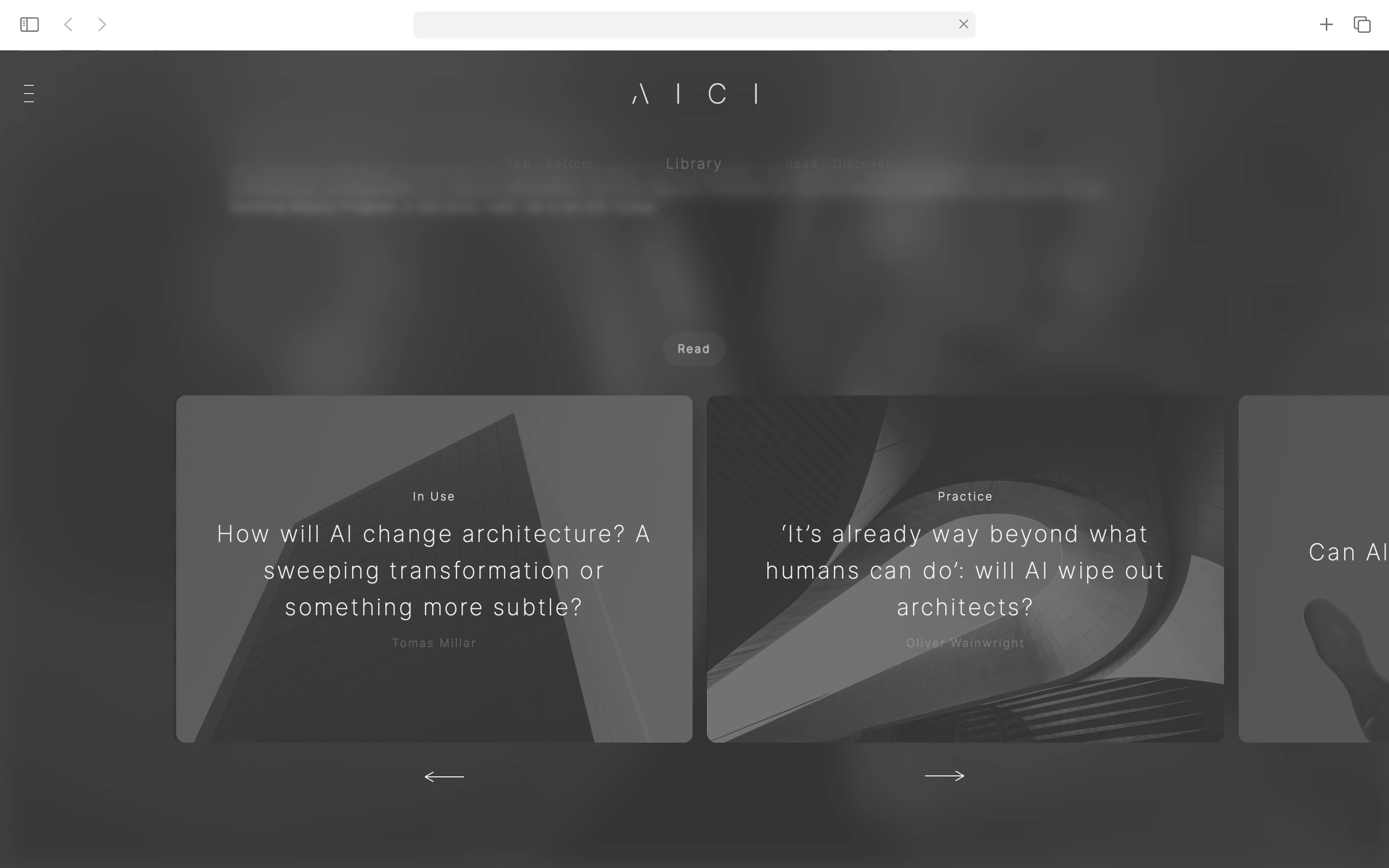
The experience is structured around two complementary CTAs: Discover our products or Read our research. Both pathways allow visitors to explore content mapped across architectural areas. The interface employs two custom blur effects that shape how visitors engage with content:
> Explore —— On page load, transitional blur effects deliver smooth, contextual movement between pages, establishing spatial continuity and orientation.
> Focus —— During scroll and navbar navigation, targeted background blur draws attention to foreground content, allowing deep engagement with research publications and technical details.
This layered approach respects the varied needs of visitors —— whether casually exploring product solutions or seeking in-depth architectural knowledge. The blur system reinforces this duality —— research exists in an open, unresolved state, whilst products emerge as fixed, high-resolution outcomes.
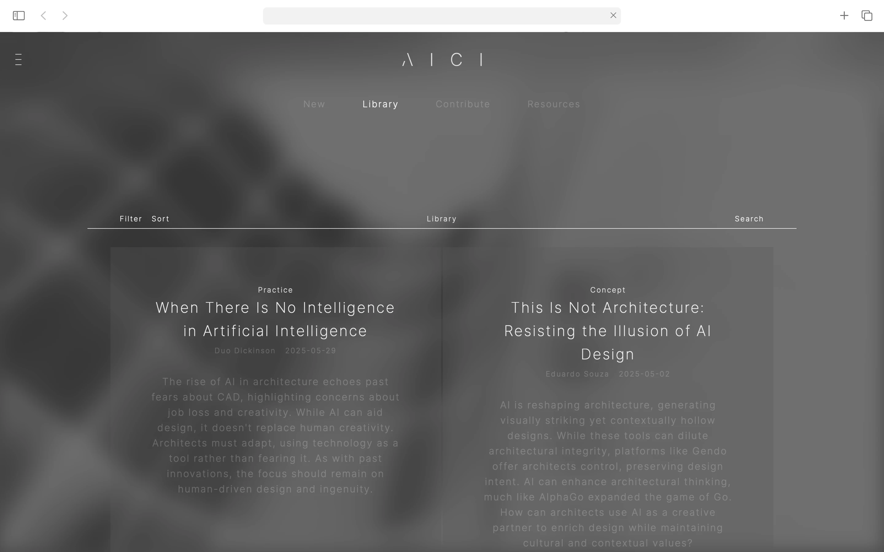
* Content Strategy:
Throughout the website, a clear, action-driven vocabulary guides user interaction —— read, discover, explore, subscribe, connect, challenge, develop. This deliberate linguistic approach reduces cognitive friction, using simple, purposeful verbs that mirror architectural thinking and decision-making.
The visual content employs a hybrid approach, merging AI-generated and real imagery (fixed images, sliders, background videos) to reinforce AICI's positioning at the intersection of digital innovation and tangible architectural practice.
——
* Deliverables:
- Branding
- Print/marketing templates
- Website (design/development)
- Copywriting & Strategy
+ Custom Production: Letterpress > business cards
* Implementation:
- Webflow platform
- Content Management System (CMS) >> 100% editable
- Responsive design: 6 breakpoints
- Typography: Variable font system with 3 sizes and 3 styles for optimal legibility
- Custom development: Bespoke JavaScript for blur effects, dynamic navigation behaviour, and smooth page transitions
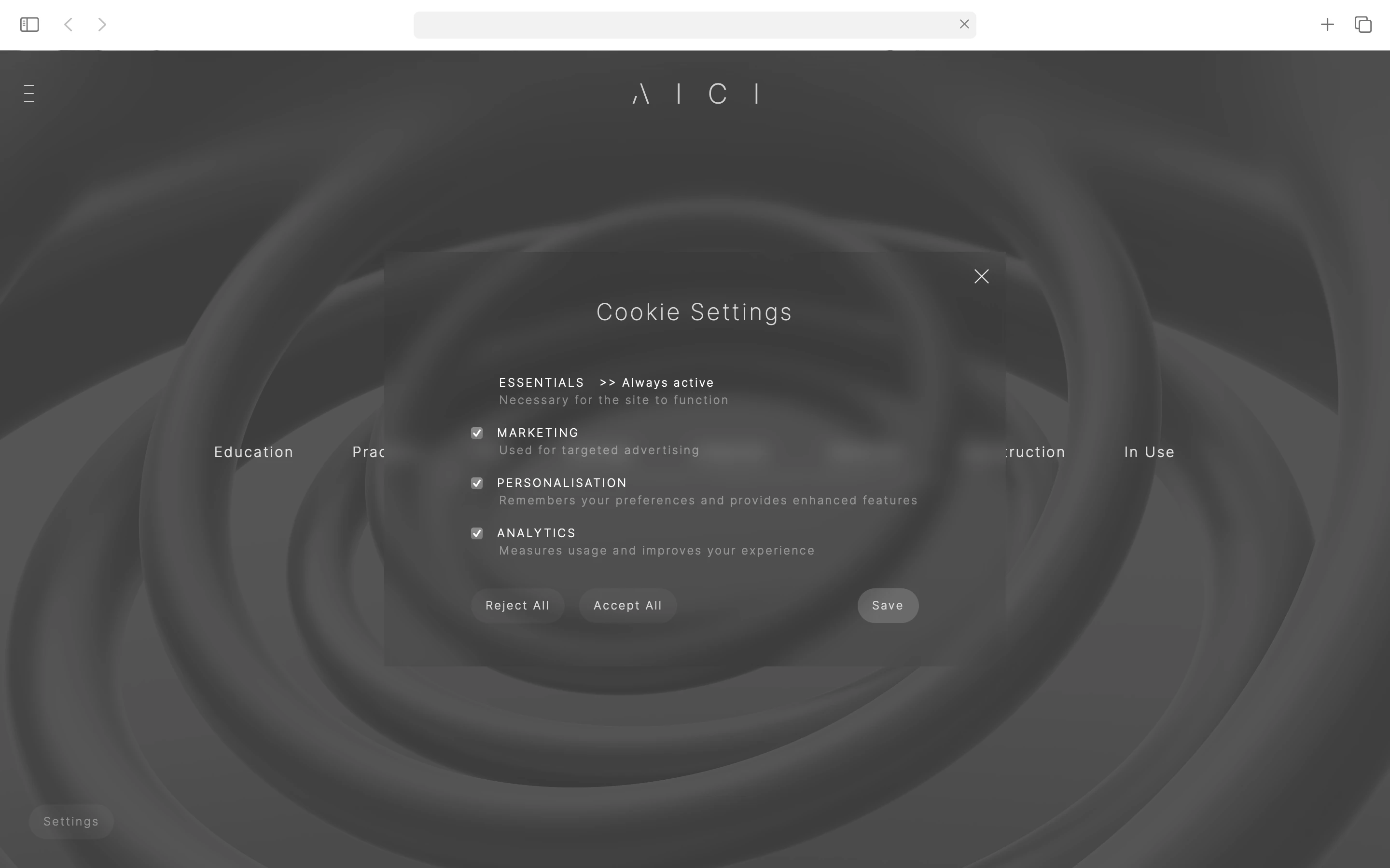
- Custom GDPR-compliant cookie consent (Finsweet)
——
* Website: link
> W1:2024
* W0:2024
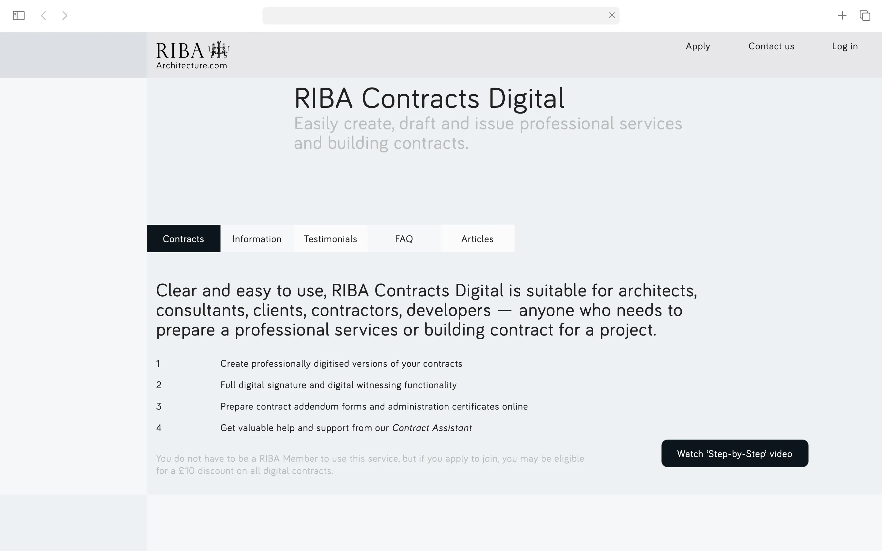
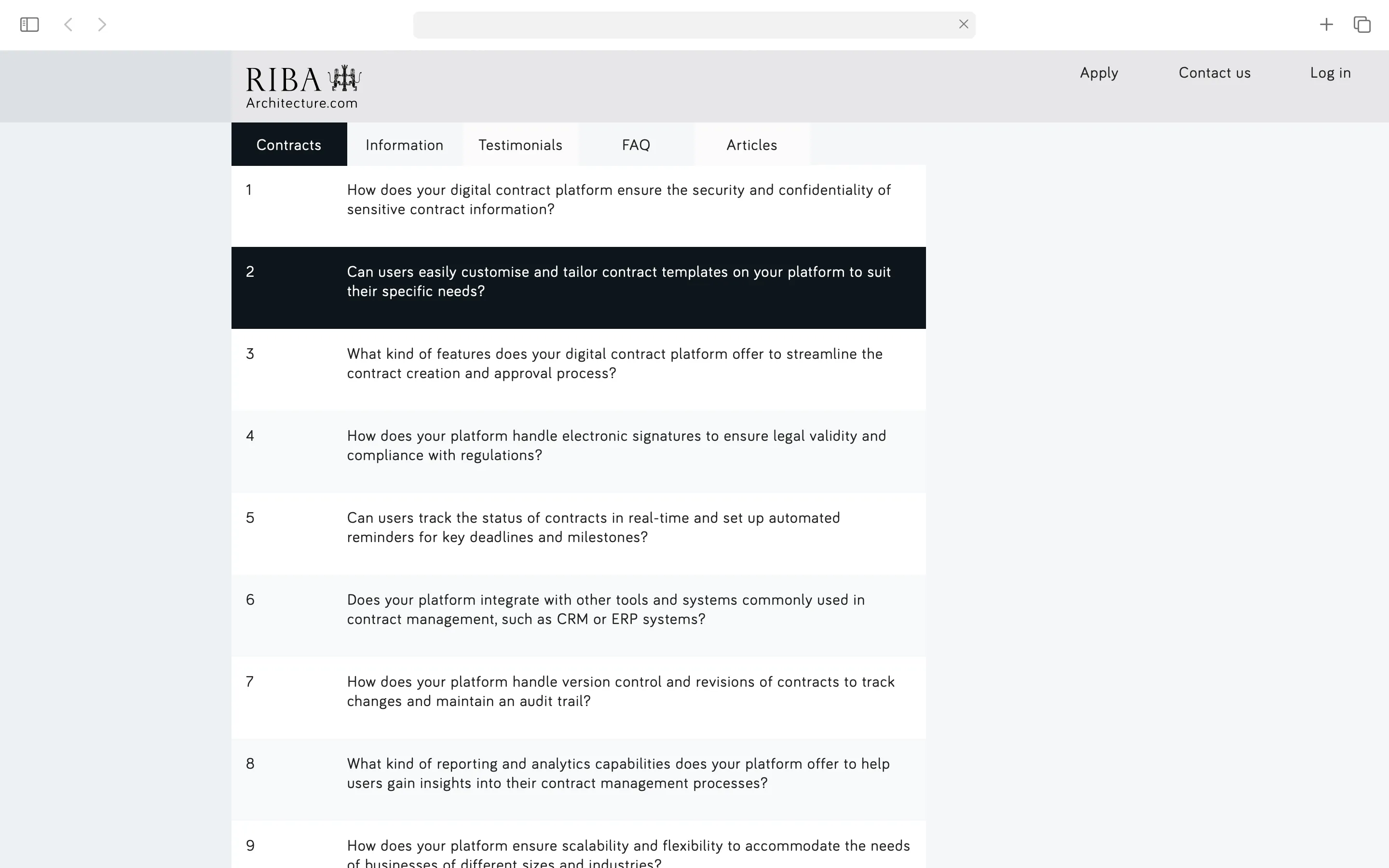
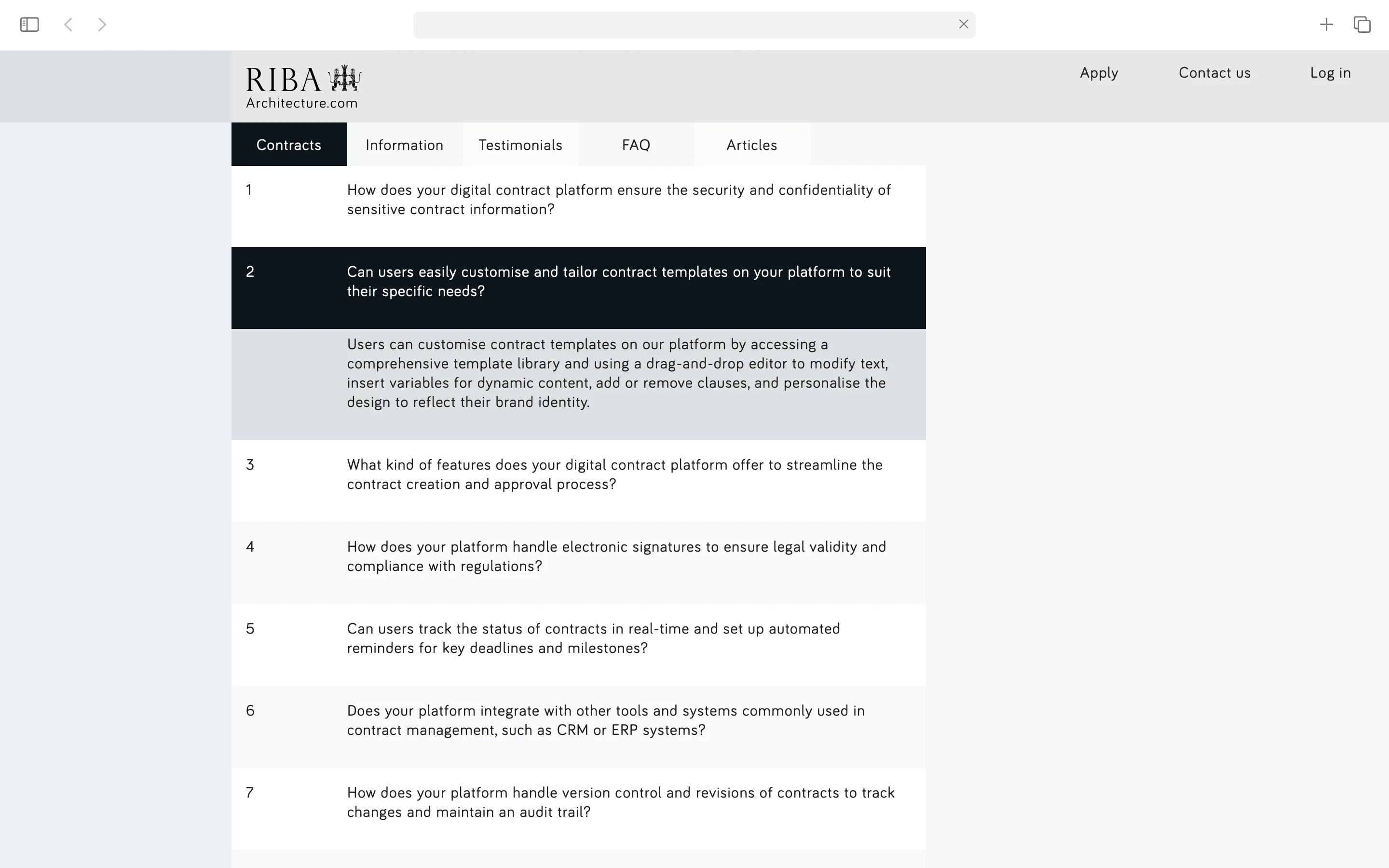
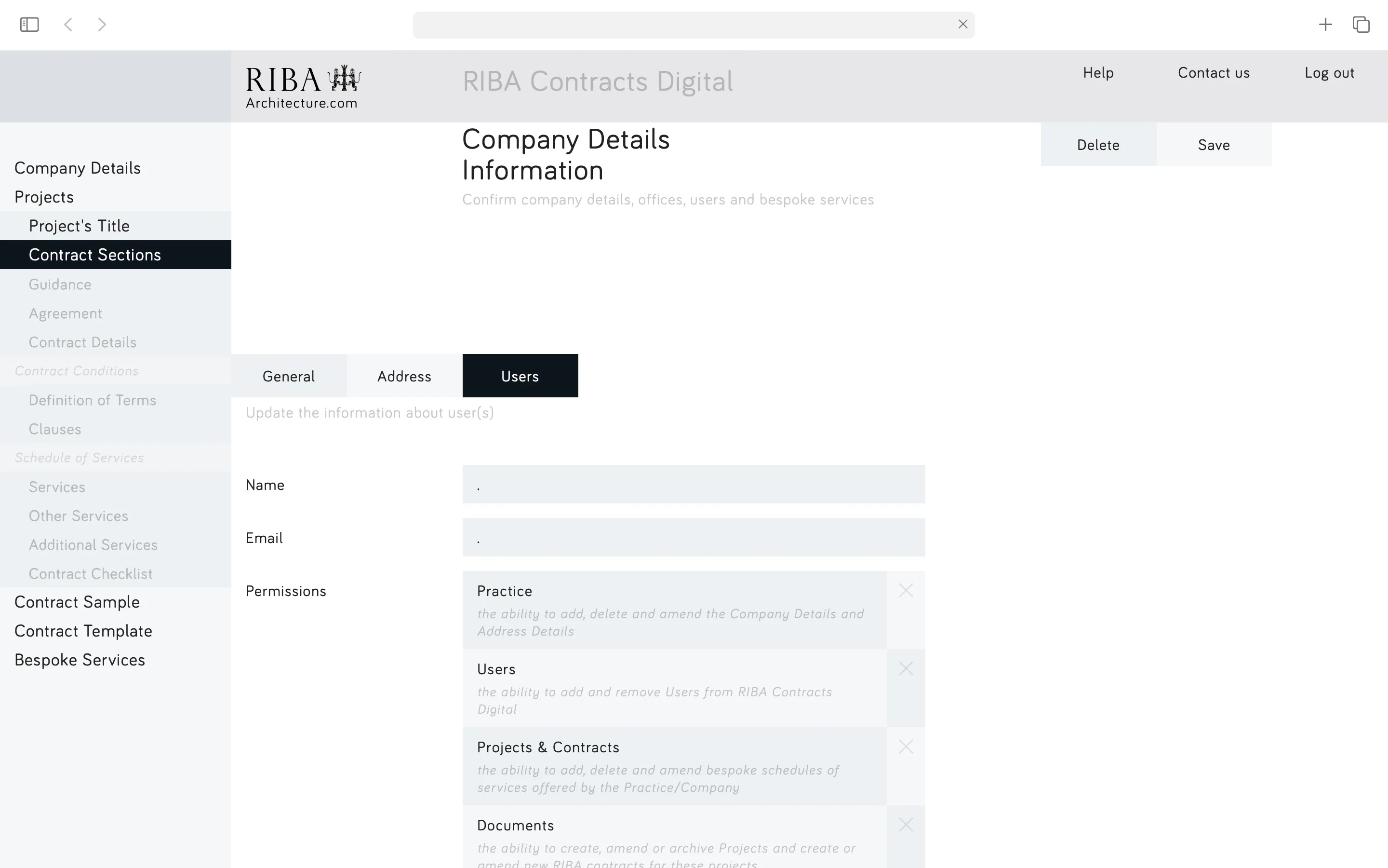
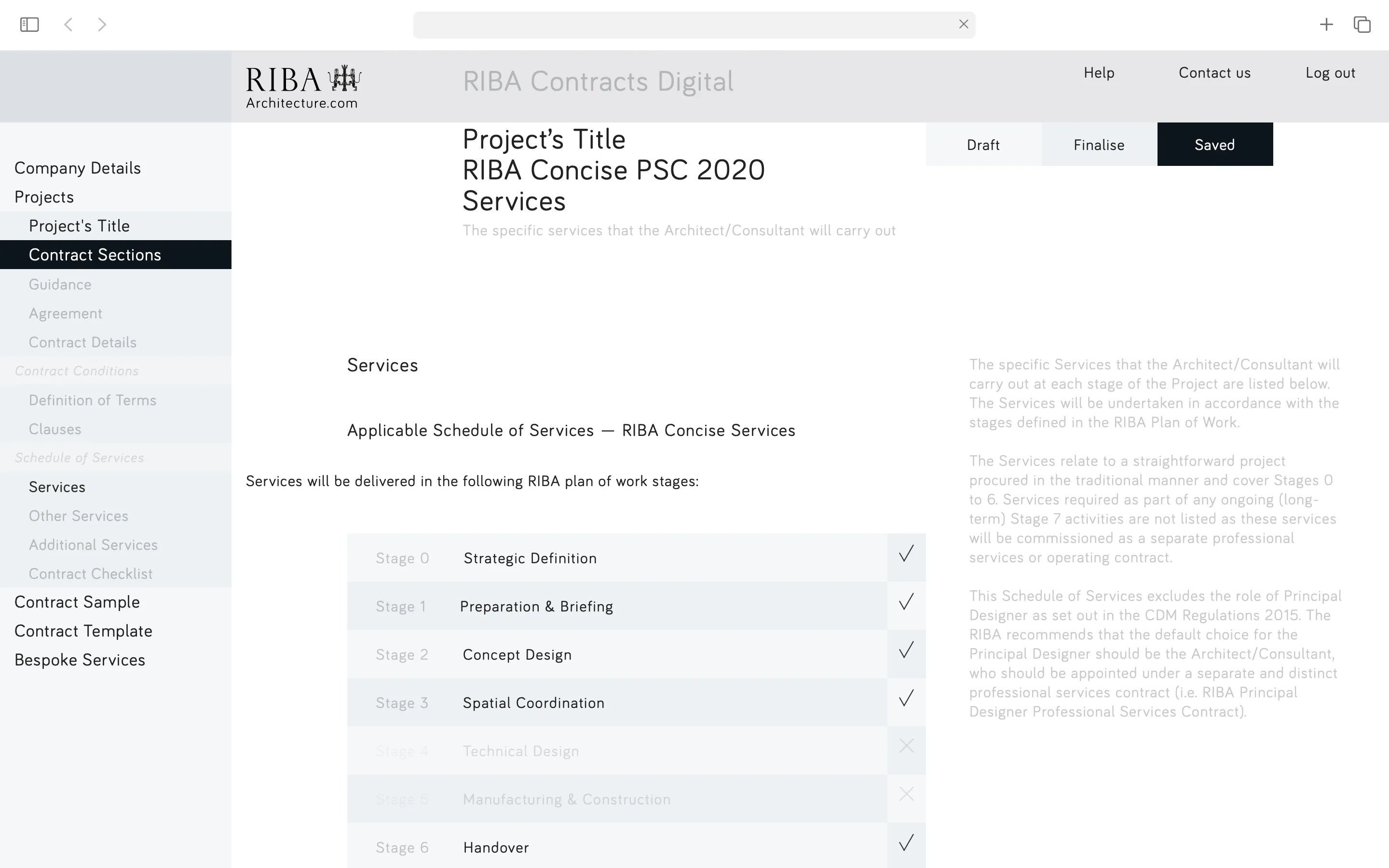
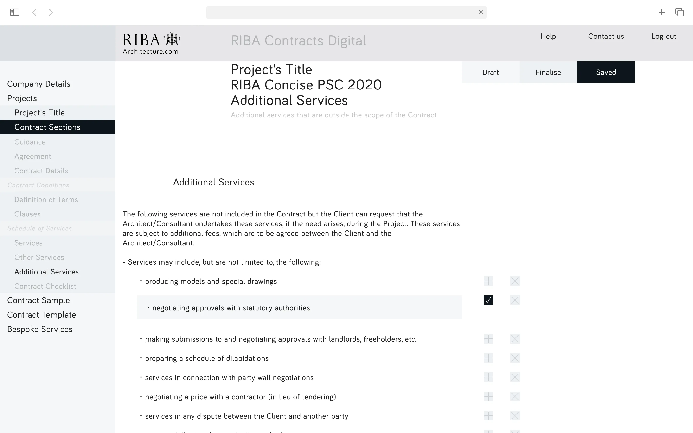
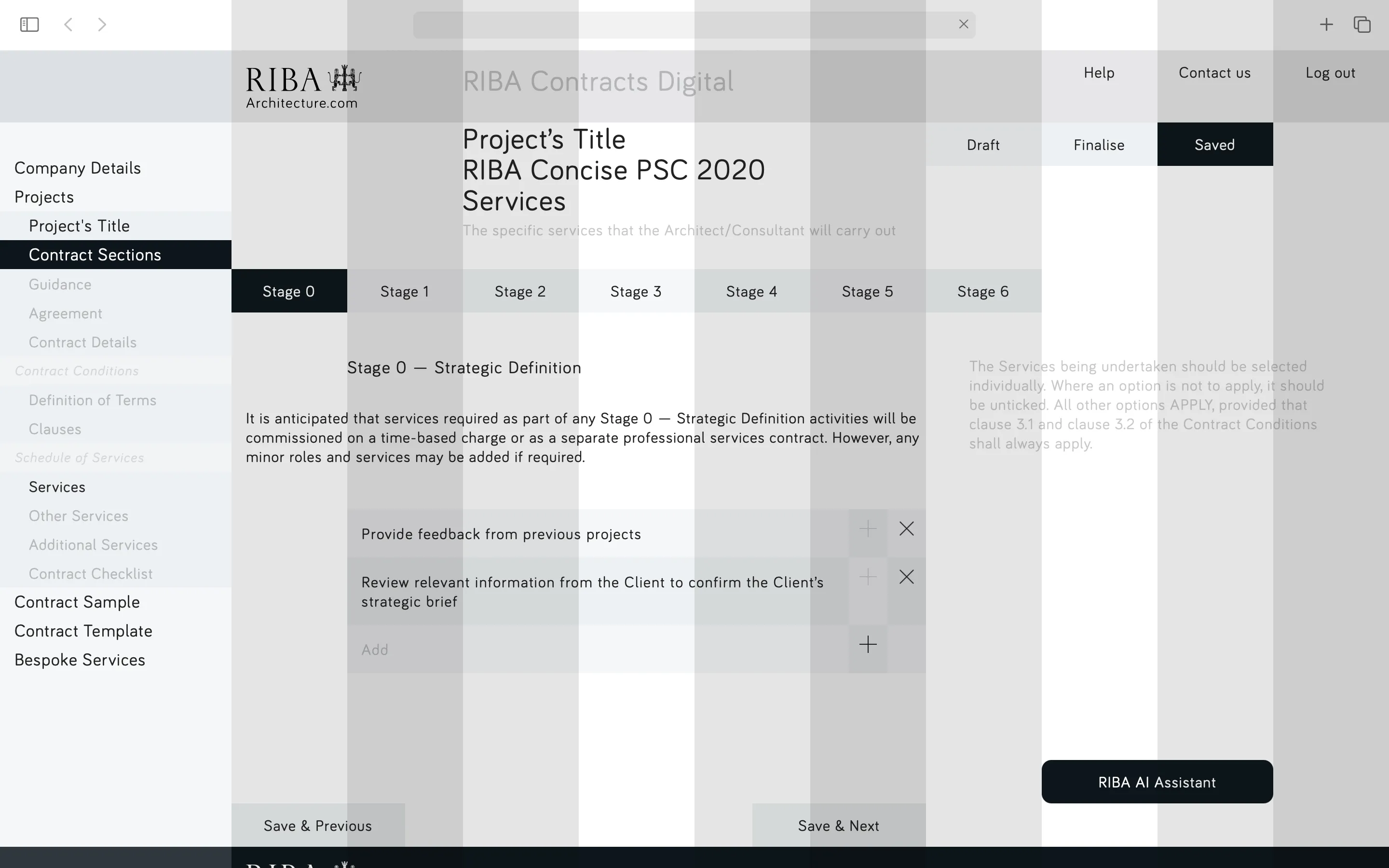
RIBA Contracts Digital allows architects and clients to create, draft, and finalise professional services and building contracts. Clear, well-drafted appointments are essential —— they define obligations and rights, protect professional interests, limit liability, and set transparent expectations for both parties.
The previous system's complexity and poor legibility created barriers to understanding —— as a result, undermining the clarity these contracts are designed to provide.
——
* Approach:
The redesign follows a two-phase strategy —— recognising that within a contract system, abrupt change risks overwhelming users who are already navigating complex legal content.
Phase 1: Creating a system supporting high content densities
Phase 2: Refining UX/UI based on user feedback from Phase 1
* Audience:
> Primary: Architects (practices of all sizes)
> Secondary: Clients, legal advisors, contract administrators
A. 3c,6c,12c = grid/layout
B. 5,15,30,45,60,90,120,180,240px = spacing
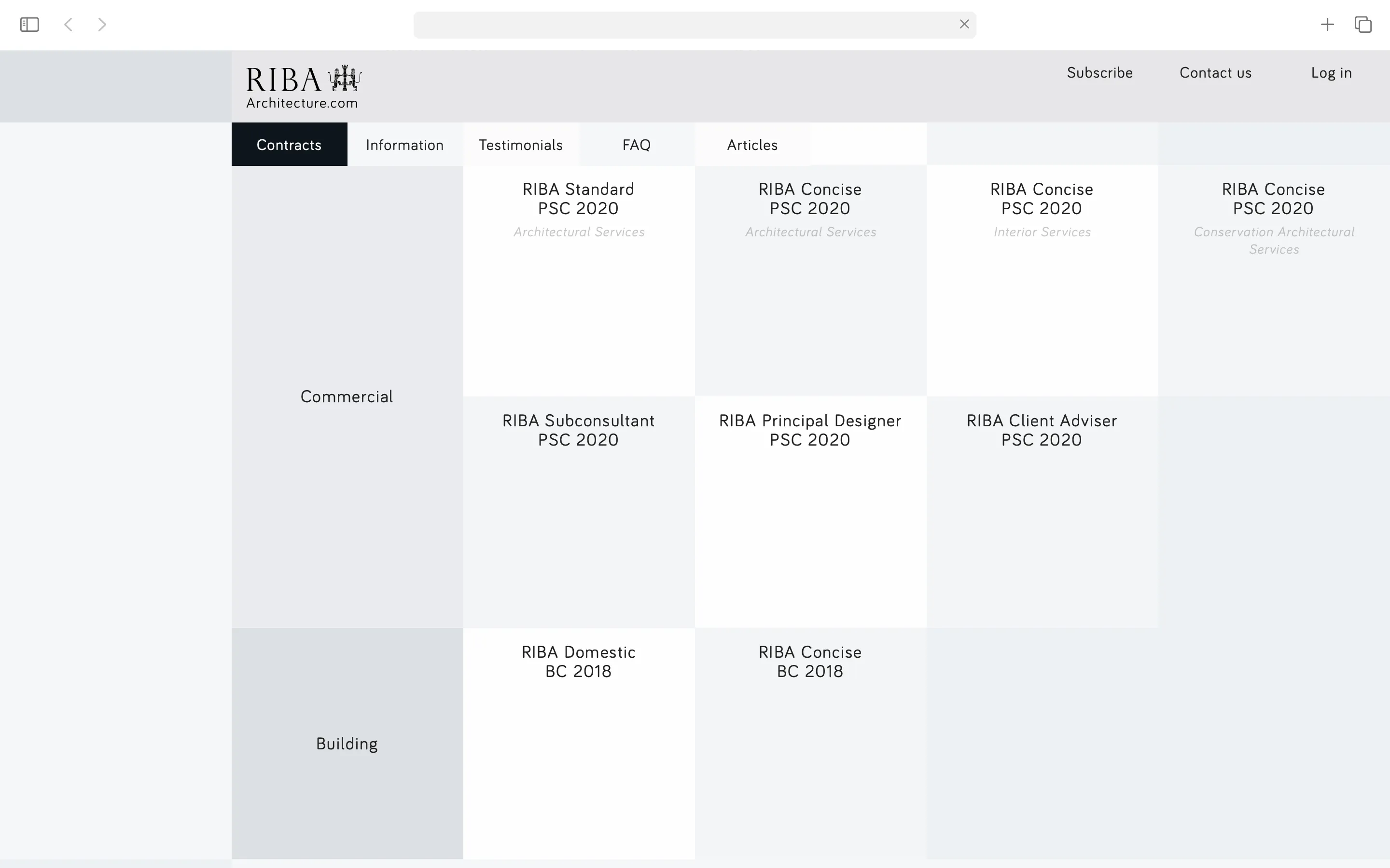
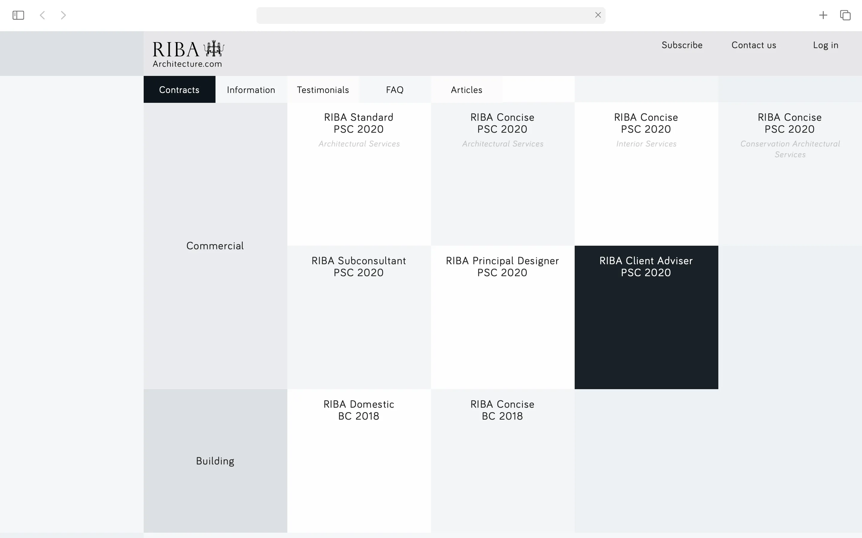
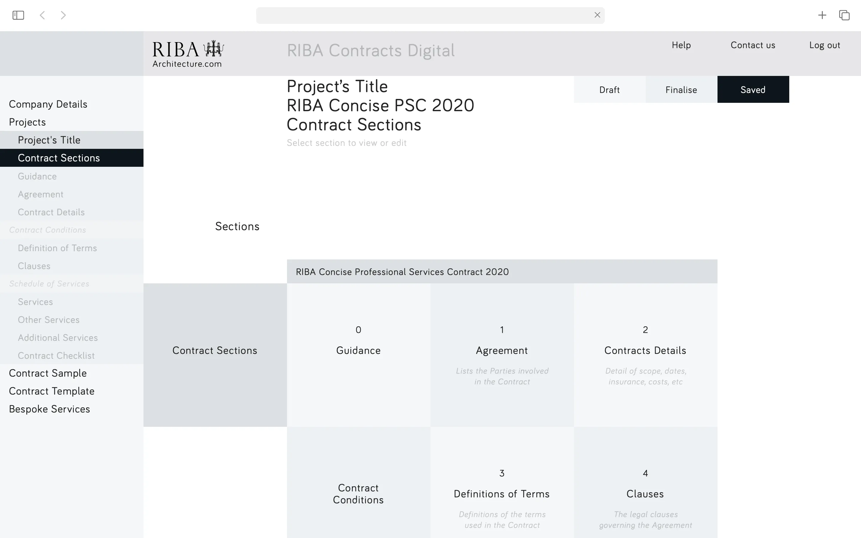
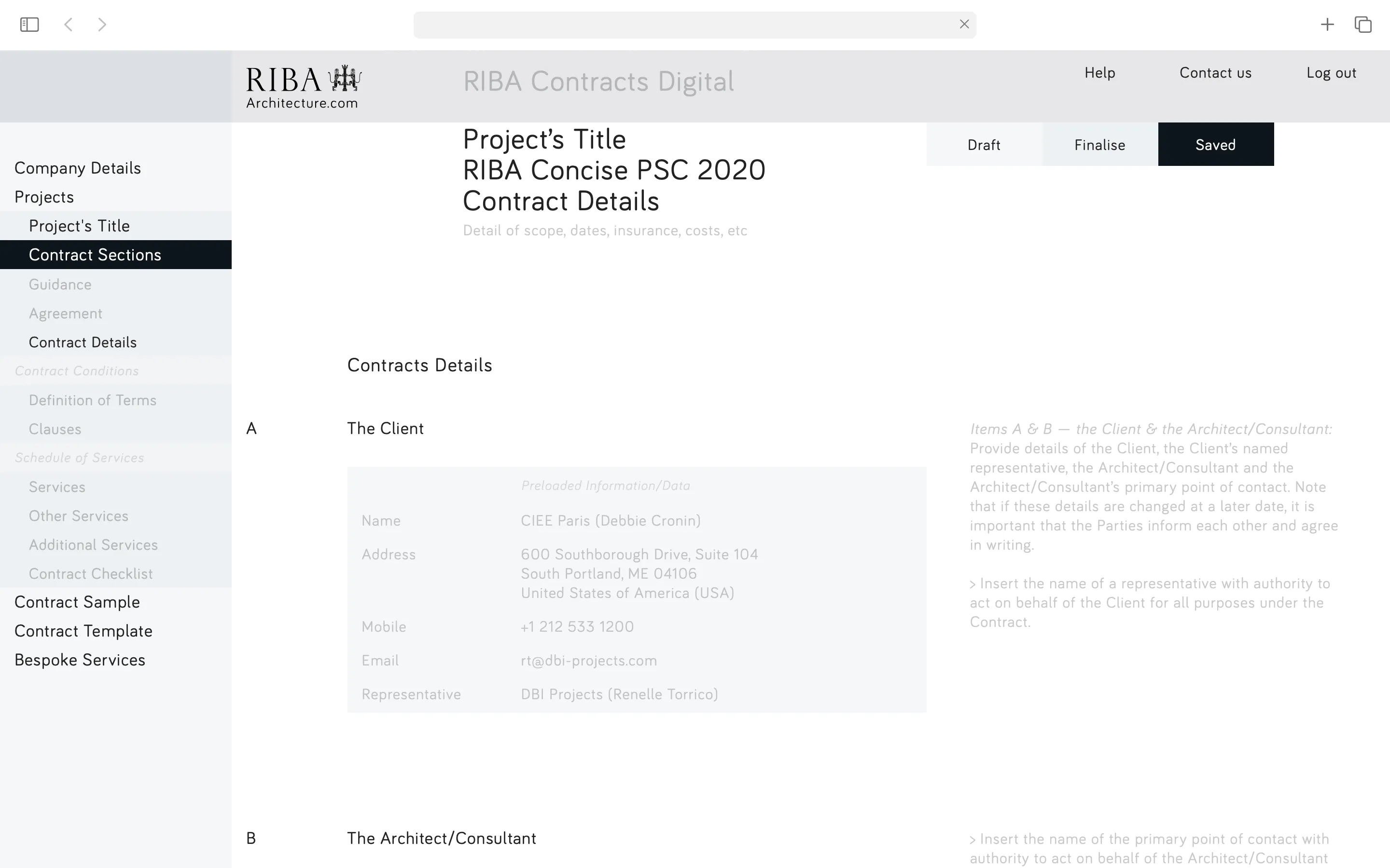
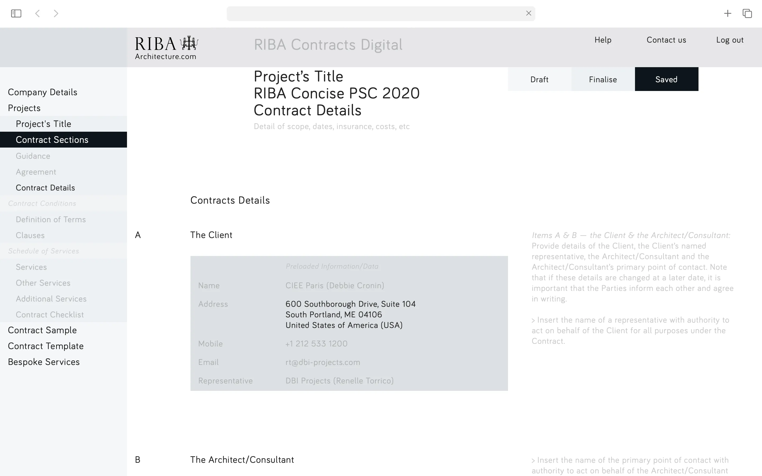
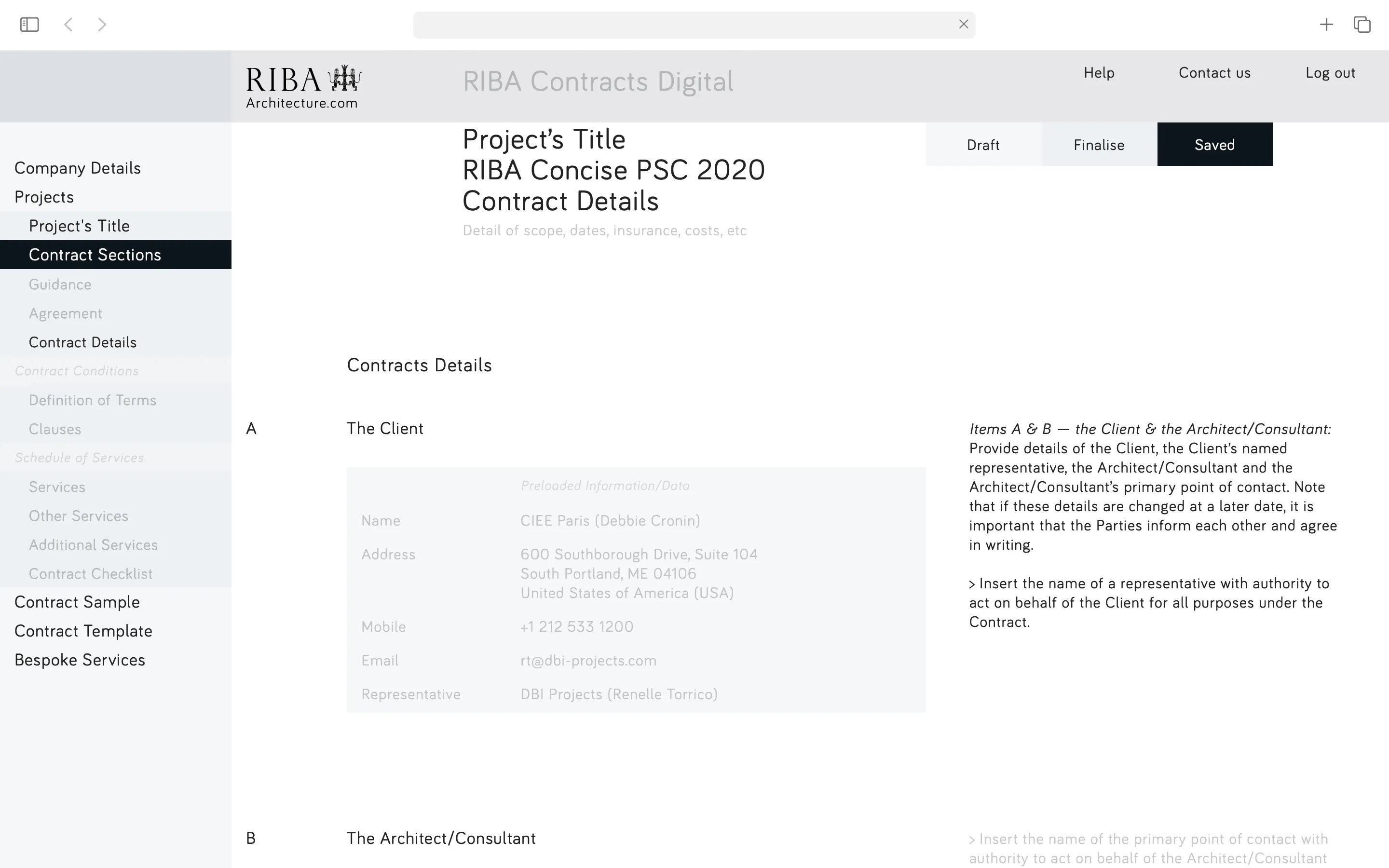
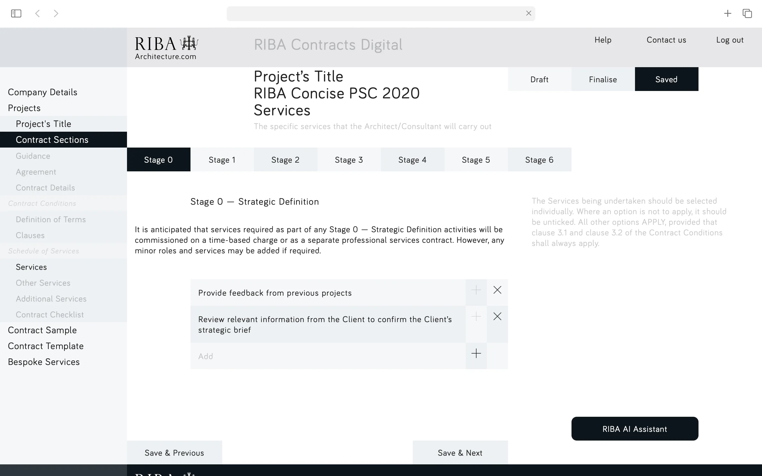
The interface is structured around a 3-part reading system: left navigation, centre primary content (the contract itself), and right secondary content (footnotes, annexes, information, and guidance). Secondary content sits at reduced opacity, allowing the contract to take centre stage, whilst moving to full legibility on hover. This hierarchy ensures users can focus on primary legal terms without losing access to supporting documentation.
A geometric grid based on precise increments provides structural consistency, whilst a 6/12 column layout supports the 3-part content distribution across desktop and tablet devices.
Soft colours organise and structure content, whilst a single strong colour (dark blue) is reserved exclusively for calls-to-action —— creating clear visual pathways through dense legal documentation.
The system enables architects to navigate complex contracts efficiently —— comparing clauses, customising agreements, and maintaining confidence in their understanding of terms and obligations.
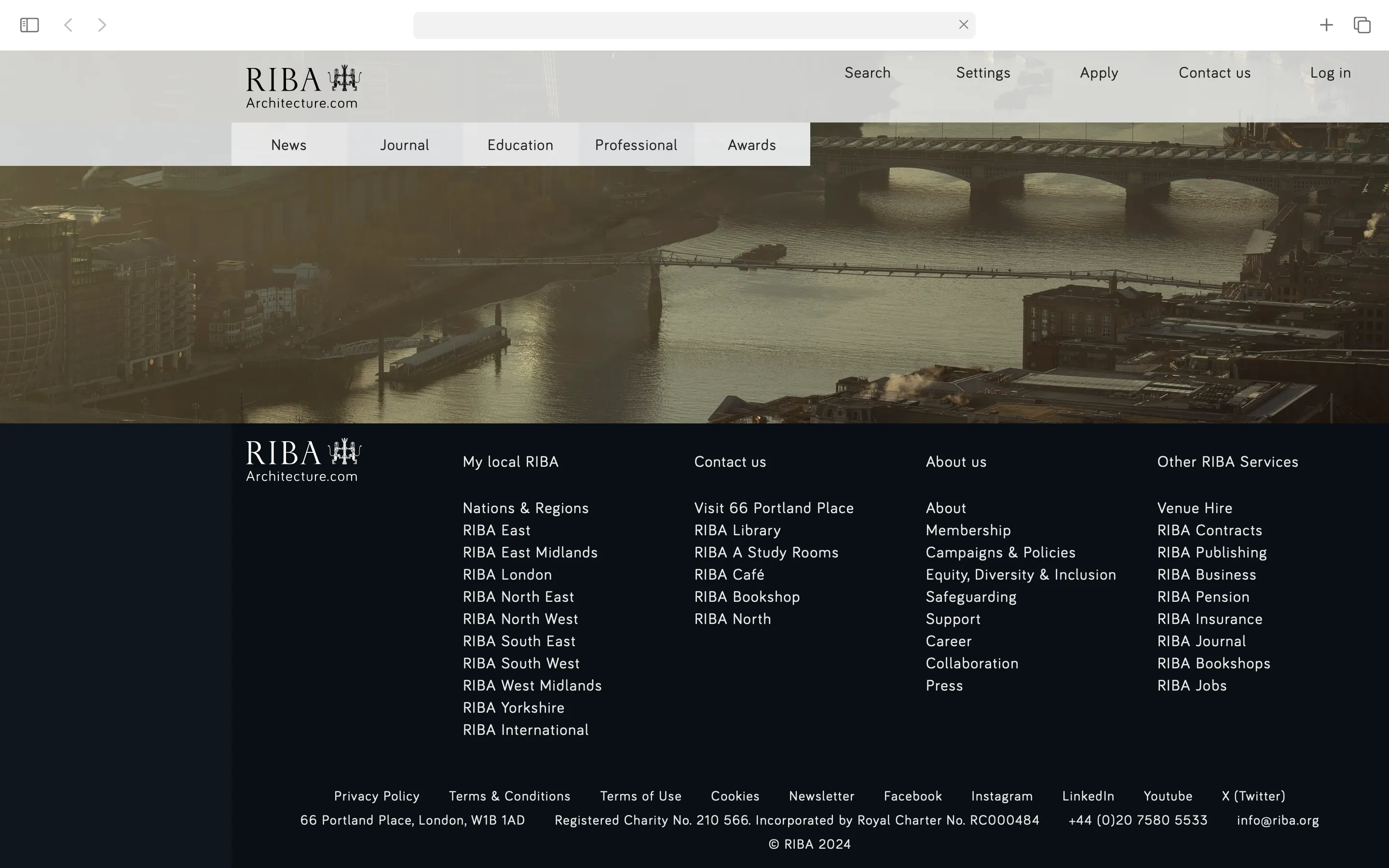
* Extended Application:
> RIBA's Digital Ecosystem
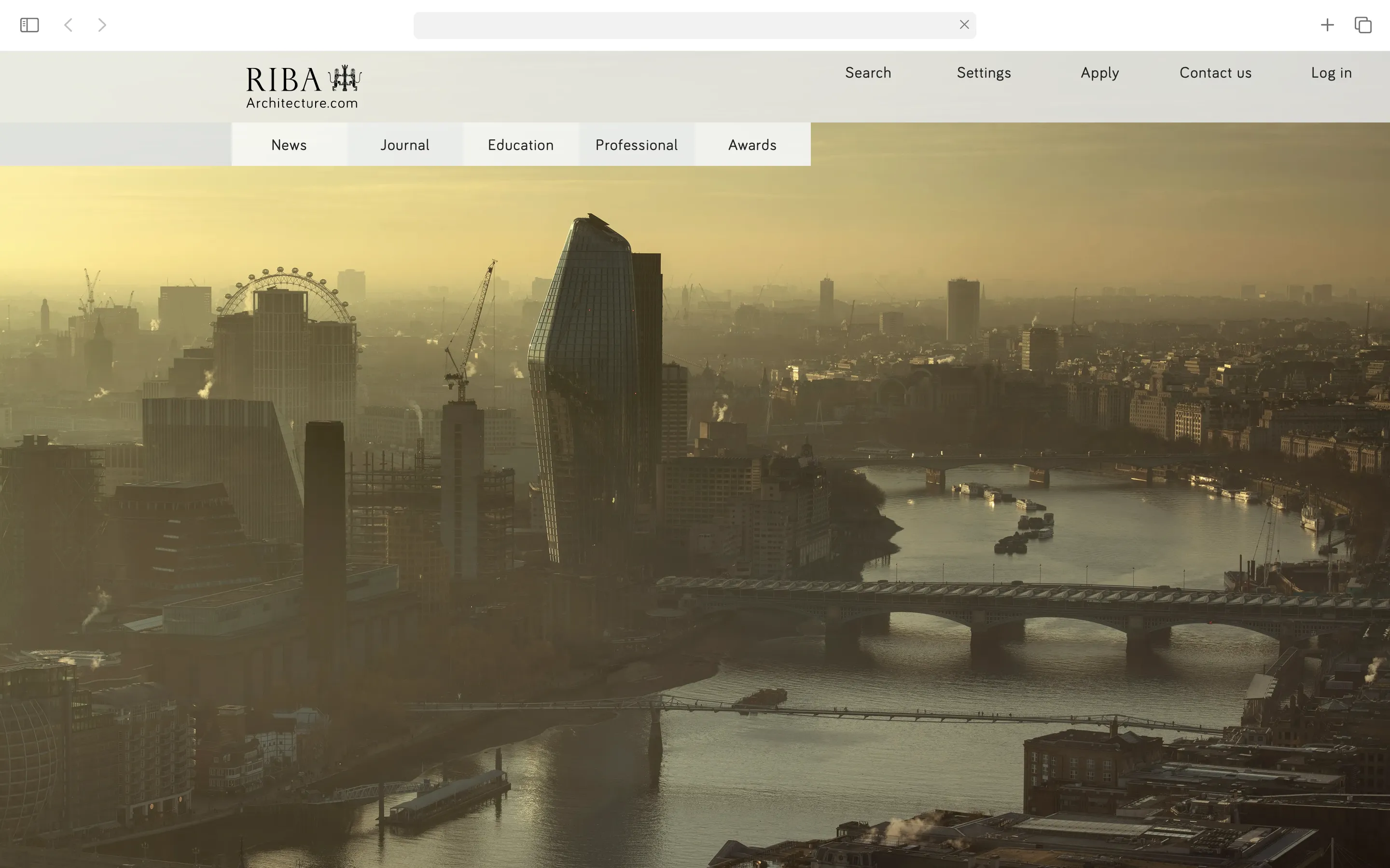
Whilst the project focused on redesigning the RIBA Contracts platform, the visual system was designed for scalability across RIBA's entire digital ecosystem. A mockup of their main website demonstrates how the interface principles —— the geometric grid, column system, and hierarchical colour logic —— could be implemented and customised across their institutional websites and satellite platforms.
* Scope:
> Collaborative project with AICI
Originally tasked with delivering PDF mockups for AICI's internal development team within a limited timeline, I completed all PDF documentation ahead of schedule. To further support the development process, I submitted a Figma link and a functional Webflow mockup —— allowing the team to examine responsive behaviours, interactions, and extract code directly, accelerating their implementation timeline.
For the client handover, a custom cloth box was designed and produced, featuring AICI's tagline —— We use AI to streamline the process of making and designing architecture —— and containing an embossed access card. This physical gesture ensured that even within a digital project, the human element of exchange and presentation remained central.
——
* Deliverables:
- Website (design)
- Website (mockup-development)
+ Custom Production: Bookbinding: box & access card
* Implementation:
- Webflow platform
- Content Management System (CMS) >> 100% editable
- Responsive design: 4 breakpoints (no mobile)
- Layout: 3/6/12 column system for content adaptability
- Geometric grid & variables: 5,15,30,45,60,90,120,180,240
——
* Website_RIBA: link
* Website_RIBA.Contracts: link
> W1:2023


editorial